Locus Technologies Unveils Significantly Enhanced GIS+ Mapping Solution
Latest Release Delivers Faster Performance, a Modernized Interface, and Deeper Connectivity Across Environmental and Water Data
MOUNTAIN VIEW, Calif., May 12, 2026 —Locus Technologies, the leader in cloud-based environmental information management software, today announced a major update to Locus GIS+, its premium web mapping solution for environmental compliance and spatial data analysis. Rebuilt on a fully standardized code foundation shared across Locus EIM, the enhanced GIS+ delivers faster performance, a more polished interface, and deeper integration with the emissions, environmental, and water data that organizations depend on every day.
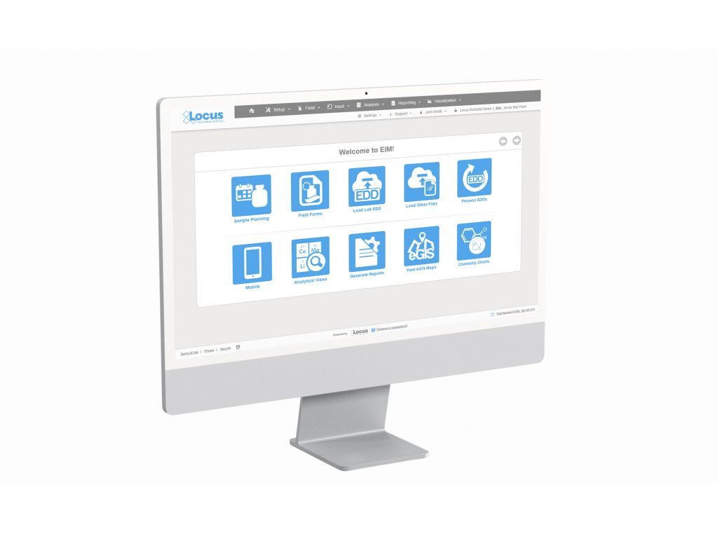
Locus GIS+ integrates directly with Locus EIM to bring environmental sampling, field measurement, subsurface, and analytical data to life on interactive maps. The solution is widely used across remediation, EHS compliance, ESG, and water utility scenarios, with organizations such as Los Alamos National Laboratory, Fortune 100 companies, and major environmental engineering firms among its active users.
The update centers on three areas of improvement: a fully redesigned user interface, enhanced map visualization capabilities, and broader compatibility with existing GIS investments.
The redesigned interface features a collapsible control panel that replaces the fixed sidebar present in previous versions, which impacted map visibility and screen real estate, particularly on smaller screens. Users can now minimize individual tools and widgets rather than closing them entirely, keeping frequently used functions accessible with fewer clicks. A reorganized layer management panel also makes it easier to view, reorder, and toggle data layers during analysis.
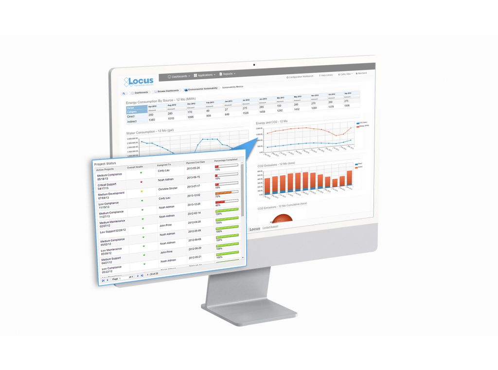
On the visualization side, GIS+ now offers improved color ramp and gradient options, giving users greater control over how data is represented on screen. The improvements are intended to produce maps that meet the presentation standards required for regulatory submittals and stakeholder reporting.
In terms of compatibility, GIS+ automatically maps locations with coordinates, with no ArcGIS Online or Portal subscription required. Users without an ArcGIS license can access Locus GIS+ built-in tools and public-domain maps for professional-grade spatial analysis. For organizations that do use ArcGIS Online or Portal, their existing maps are available once they sign into their AGOL or Portal account within GIS+, eliminating the need for complex data exports and imports between systems. Because environmental and emissions data and EIM workflows can be highly complex, the value of that seamless integration scales with the sophistication of an organization’s data environment — the more complex the workflows, the greater the time and effort saved through reduced manual data handling.
Underpinning all of these enhancements is the move to a standardized code framework shared across all of Locus EIM and Locus Platform. The result is faster map and data loading, a consistent user experience across Locus applications, and the ability to access the full depth of an organization’s environmental data record without redundant data entry between EIM, LP and associated apps.
“Environmental data has always been at the core of what we do, but the way organizations need to use that data continues to expand,” said Neno Duplan, Founder and CEO at Locus Technologies. “Our investments in GIS+ reflect a long-term commitment to giving environmental professionals the most connected and capable tools available. As this data increasingly drives water management, EHS compliance, and ESG reporting, our objective is to make Locus the platform where all of it comes together seamlessly. Over time, every application within the Locus ecosystem will share a unified GIS+ layer, enabling full integration and correlation across water, air, waste, and sustainability domains. This creates a truly single platform experience, where customers can operate all their EHS and ESG applications within one integrated, GIS-driven environment.”
Locus GIS+ is available as an add-on to existing Locus configurations. To learn more, schedule a demo, or request a quote, please contact info@locustec.com or visit us at www.locustec.com.
About Locus Technologies
Locus Technologies pioneered cloud software for EHS compliance, water management, and ESG reporting in 1997 and remains the longest serving pure-play SaaS provider in the sector. Organizations ranging from mid-size enterprises to Fortune 100 corporations rely on Locus to manage more than half a billion environmental records worldwide. Locus software manages air, water, waste, energy, emissions, site, and incident data within a configurable platform for risk mitigation and regulatory reporting. With industry-leading methods for data intake, artificial intelligence, queries, validation, tracking, visualization, and tasking, Locus is uniquely suited for the most complex or consequential operations — where accuracy and credibility cannot be compromised. Locus Technologies is headquartered in Silicon Valley, California. To learn more, visit www.locustec.com.