Utilizing the Uniqueness of GIS for Better Environmental Data Analysis

Today is GIS Day, a day started in 1999 to showcase the many uses of geographical information systems (GIS). Earlier Locus blog posts have shown how GIS supports cutting-edge visualization of objects in space and over time. This post is going to go “back to basics” and discuss what makes GIS unique and how environmental data analysis benefits from that uniqueness.

Spatial vs Non-Spatial Relationships

So, what makes GIS unique? It’s the ability of GIS to handle spatial relationships, which goes beyond just putting “dots on a map”. You are probably familiar with non-spatial relationships such as greater than, less than, or equal to, and you probably use them every day. For example, suppose you want to buy the latest gaming console (PS5, anyone?). You need to compare the price of the console to your bank account. If the console price is greater than your savings, then you cannot buy the console.

Or can you? With credit cards, you can pay later, so you go charge the console. At the time of the transaction, some software evaluates a non-spatial relationship and checks if the console price plus your current debt is less than your credit limit. If so, you can buy the console; if not, your purchase is denied.

The key point about this example is that spatial relations play no part. It doesn’t matter where you are located or where the game console is sold from. (OK, there may be things like state taxes and shipping, but that just contributes to the price.) Now, if you were trying to find all gaming consoles for sale within a certain distance of you, that is a spatial relationship. There are multiple types of spatial relationship, but the most common are inside, contains, crosses, overlaps, and within a distance of. Standard relational database software does not handle these sorts of relations, but GIS can.

As an illustration, let’s consider two current events: the 2020 US presidential election and the COVID-19 pandemic. With non-spatial relationships, you can answer various questions such as “did Biden get more votes than Clinton?” or “is the number of positive COVID tests increasing?”. But with spatial relations, you can answer more interesting questions such as “did areas with COVID hot spots vote more predominantly for Biden or Trump?”. For this question you must see if voters lie inside a COVID hot spot; a GIS can perform this analysis and then map the results. While many votes are still being counted, as of this blog post, it appears Trump performed better in COVID hot spots.

Spatial Relationships in Environmental Data

Let’s look at some example of spatial relations in environmental data. Assume you have a database of tritium sampling results in water, along with various map layers of natural and manmade features. What kind of spatial relationships can you explore with GIS?

To answer that, we’ll make some maps with the Locus GIS+ package in EIM, Locus’s cloud-based, software-as-a-service application for environmental data management. All maps shown here display wells with tritium samples, with the wells represented as colored circles. The color scale goes from blue through yellow to red, to indicate increasing tritium results.

Figure 1 shows an example of an inside spatial relationship. The map answers the question “what wells with tritium results are inside the Mortandad Canyon watershed?”. The watershed is highlighted in blue on the map, and you can easily see the wells inside the watershed.
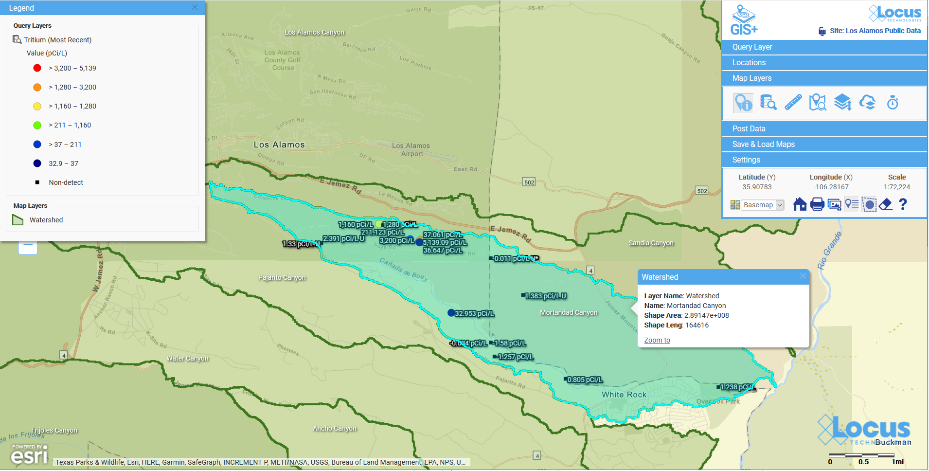
Locus GIS | Wells with tritium

Figure 1: Wells with tritium within a watershed

Figure 2 shows wells with tritium results that are within a distance of a river. The map answers the question “what wells with tritium results are within 500 ft of the river?”. The river, highlighted in light blue, has a 500 ft buffer shown as a dotted blue line. The wells with tritium that lie within the buffer are shown on the map, so you can check if any high tritium results are close to the waterway.
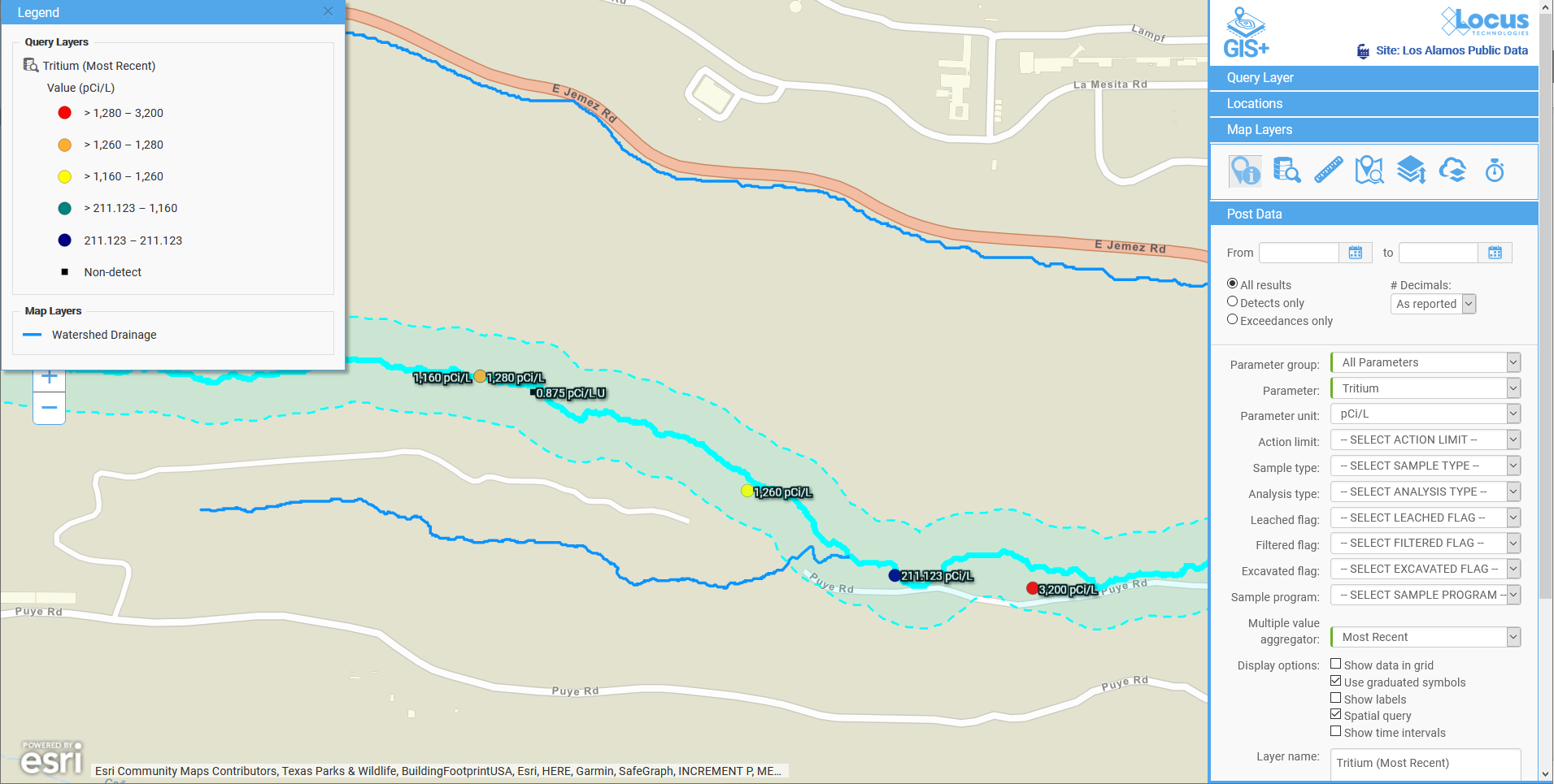
Locus GIS | Wells with tritium

Figure 2: Wells with tritium within a specified distance of a river

Figure 3 shows another example of within a distance of. Here, the map answers the question “what wells with tritium results are within two miles of a middle school?”. The two-mile radius is shown as a shaded blue circle centered on the school. You can see the wells are confined to the area southeast of the school.
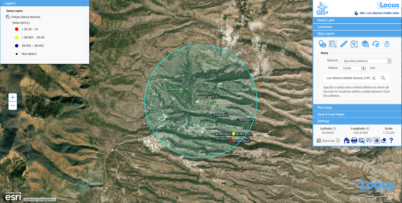
Locus GIS | Wells with tritium

Figure 3: Wells with tritium within a specified distance of a school

These three examples are just a small subset of what can be done with GIS and environmental data. Here are some other questions illustrating the kind of spatial analysis that GIS supports.

  • Have any spill incidents at my site been within a specified distance of a waterway?
  • Do any pipelines at my site cross protected waterways?
  • Do any remediation areas at my site contain wells that have recorded high chemical levels in water?
  • Does the underground plume from a chemical release overlap any aquifers?

All these examples illustrate the power of GIS for analyzing spatial relationships, and these examples are just the beginning. GIS can also perform more sophisticated analyses that look at spatial relationships in different ways to answer questions such as:

  • How confident can we be in the results of the spatial relationship analysis?
  • Do all data records follow the spatial relationship, or are any outliers that fall outside the norms?
  • Has this spatial relationship changed over time? Has the relation grown stronger or weaker?
  • Can we predict the future of the spatial relationships?

Locus continues to bring new analysis tools to our Locus GIS+ system for environmental applications. These applications let you take advantage of the unique ability of GIS to analyze spatial relationships in your environmental data.

Acknowledgments: All the data in EIM used in the examples was obtained from the publicly available chemical datasets online at Intellus New Mexico.


Interested in Locus’ GIS solutions?

Locus GIS+ features all of the functionality you love in EIM’s classic Google Maps GIS for environmental management—integrated with the powerful cartography, interoperability, & smart-mapping features of Esri’s ArcGIS platform!

Learn more about Locus’ GIS solutions.


About the Author—Dr. Todd Pierce, Locus Technologies

Dr. Pierce manages a team of programmers tasked with development and implementation of Locus’ EIM application, which lets users manage their environmental data in the cloud using Software-as-a-Service technology. Dr. Pierce is also directly responsible for research and development of Locus’ GIS (geographic information systems) and visualization tools for mapping analytical and subsurface data. Dr. Pierce earned his GIS Professional (GISP) certification in 2010.
Valley Water selects Locus Environmental Software for Data Collection and Management

Locus will provide water quality and analytical data management software for Valley Water

MOUNTAIN VIEW, Calif., 1 September 2020 — Locus Technologies (Locus), industry leader in water data management software, today announced that Valley Water (formerly Santa Clara Valley Water District) has chosen Locus environmental software for their data collection and management. 

Valley Water has selected Locus’ environmental software, EIM, following consultant work Locus provided for the utility going back 14 years. They will seek to utilize Locus EIM as a laboratory database management system, and for data analytics.Locus EIM will be used to manage sample data for over 200 million gallons of drinking water consumed daily by over 2 million people in the district. 

Valley Water has an award-winning track record of bringing the highest-quality water to the Bay AreaBeing local, we see the hard work that Valley Water puts into providing some of the best drinking water available anywhereWe are proud to be a part of that process,” said Wes Hawthorne, President of Locus.  

Technology Outlook for the Environmental Industry

Neno Duplan is founder and CEO of Locus Technologies, a Silicon Valley-based environmental software company founded in 1997. Locus evolved from his work as a research associate at Carnegie Mellon in the 1980s, where he developed the first prototype system for environmental information management. This early work led to the development of numerous databases at some of the nation’s largest environmental sites, and ultimately, to the formation of Locus in 1997.

Mr. Duplan recently sat down with Environmental Business Journal to discuss a myriad of topics relating to technology in the environmental industry such as Artificial Intelligence, Blockchain, Multi-tenancy, IoT, and much more.

Download a preview.

Click here to learn more and purchase the full EBJ Vol XXXIII No 5&6: Environmental Industry Outlook 2020-2021.

5 Keys to Simpler Air Quality Monitoring

Time management is an ever-present struggle. With expanding air quality monitoring and regulatory programs, more is expected from air quality professionals without compromising work quality. Locus Technologies offers the tools to ease your workload. Here’s how Locus transforms your air quality data and reporting management:


Integration

Integration can save you a great deal of time and stress with the most cumbersome air quality data management duties. Our air quality software has a unique point and click integration application enabling connection with major databases and third-party systems that have open API (access privileges). Some integration, database, and communication standards and methods that are supported include OLE compliance, SOAP, COM, Java, XML, web services, DBC/ODMA/SQL/Oracle, AWS, VIM, and MAPI.

Locus also provides a powerful two-way synchronization with MS Excel, allowing users to download to Excel, then work, edit, verify, or append data on their local copy of Excel. Any revisions they perform to the downloaded data can be automatically synchronized back to the Locus Platform application. During the process, a complete audit trail will be preserved. This is a great time saver, especially if you are sending large volumes of valid values in a database or if you are migrating any historical data.


Dashboards Tailored to Your Needs

Your air quality data management software should have built-in dashboards to meet your needs. With other software providers, when you need a new report, chart, or other visualization of your air quality data, it usually incurs a custom software development charge. Locus allows you to assemble the information you want in your chosen format (bar or line charts, maps, tables, treemaps, diagrams, etc.) and share your custom dashboards and real-time information/data with your team or regulators without the fees. In addition, the views and dashboards export to Excel, so you can easily integrate with commonly used tools and further mine the data.

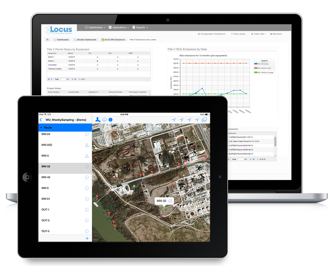
Environmental compliance software screenshot of Locus Platform Air Quality Title V dashboard with iPad for air quality monitoring samples

With Locus, powerful dashboards will help you understand the status of single of multiple facilities in an air quality program based on a matrix you design. With the the flexibility of Locus, facility information can be automatically populated based on the user credentials, saving you and your team time and frustration.


Simplified Reporting

Locus Platform’s air quality application and calculation engine supports simultaneous calculations using multiple methods for various reporting programs including EPA, State, or Local, CDP, TCR, DJSI, Title V, e, and others. Our software also assists in streamlining your emissions tracking and reporting requirements for programs such as GHG, Fenceline, Title V, and LCFS. Locus air quality software is fully integrated with our compliance/asset management and remote sensing systems, making digital transformation more efficient. In addition, Locus’ vapor intrusion and indoor air management application will easily organize, manage, and report indoor air and vapor intrusion data.

GHG and Title V Exports

This allows users to input data only once and utilize it to report to multiple federal, state, and voluntary reporting programs, according to your required format. The application will also support direct electronic reporting formats for many reporting programs, so that additional manual transcription and submittal of data are no longer necessary. This is a very powerful tool and a huge advantage to customers in terms of improving efficiency, while reducing costs.


Mobile

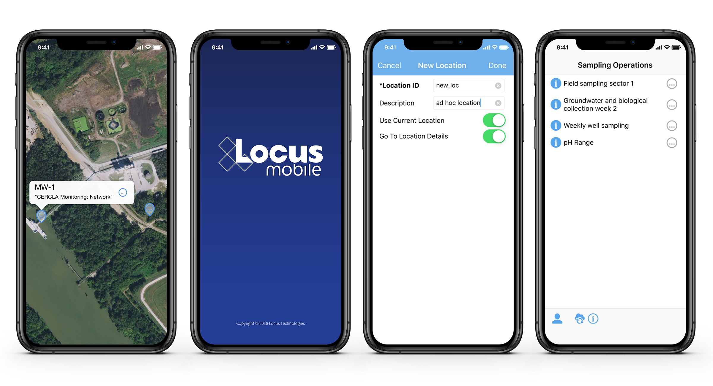
Locus’ Mobile application allows you to sync with your server to create in-field data collection profiles on a mobile device, whether it’s your phone or a tablet. It will allow you to click through and enter field inspection data on the device even when you are offline. Air quality field operations data validation is performed in real-time and is stored locally on the device when you are out of service range, with data will automatically being updated in Locus’ cloud when you have connection.

Locus Mobile

Locus gives the benefits of data entry directly on the mobile device, with immediate data availability on the cloud when you reach an internet signal. Other advantages of using Locus Mobile includes location metadata and mapping integration, bar-code/OR code scanning, voice recognition, and form customization.


Easy to Use Calculation Library

To alleviate the effort in researching complex air emissions calculations ranging from GHG to Tank emissions, Locus has designed a Java Library, Curta, for complicated scientific computing on our software. Curta contains a collection of built-in functionality, unit conversions, periodic and hierarchical calculations that can be used to solve mathematical models of problems in Science and Engineering.

Curta can be used directly as API (Application Program Interface) in the UI (User Interface) design, or implicitly combined with the Locus Platform Sustainability application with clear break down into calculation indicators and sources. It offers an integrated solution to work with different data types, continuously changing inputs and large set of unknown variables.

Curta features include:

  • Calculation engine suite Independent code base for Curta only, safe and stable for any applications and platform.
  • Sequential calculation steps Curta can construct multi-step calculation structure where formulas can build on each other without knowing the exact values at the initiation of the calculation.
  • Conditional calculation logics Calculation steps can be set with conditions and logic for example effective date, input units, tank type etc.
  • Hierarchical calculation results Calculations can be designated to sources with hierarchy with Curta able to acknowledge the parent-child relations of the sources and present it as a calculation tree.
  • Execute parallel calculations for periodic data Curta can repeatedly conduct complicated calculation structure on a periodic base.
  • Execute parallel calculations for multiple sources Curta can repeatedly conduct complicated calculation structure for multiple linked sources for example facilities, tanks etc.


Stay in Compliance With Smart Sample Planning and Management Tools

Evergreen Natural Resources Selects Locus Technologies for Environmental Software

Locus will provide environmental field and analytical data management software for Evergreen Natural Resources.

MOUNTAIN VIEW, Calif., 17 March 2020 — Locus Technologies, industry leader in environmental software, today announced that Evergreen Natural Resources, a privately-held energy company based in Denver, Colorado, has chosen Locus environmental software for their data collection and management.

Evergreen Natural Resources has selected Locus’ environmental software, EIM, after proof of concept and usability testing. They will seek to utilize Locus EIM as a laboratory database management system, and for regulatory report generation, while also taking advantage of Locus’ premium GIS tool, GIS+, as well as Locus Mobile.

“With over 2,600 unique locations that require routine sampling, Locus’ environmental and GIS software allows us to collect, manage, visualize, and analyze data. Locus EIM aligns with our strategy to increase availability and reduce our internal application infrastructure footprint,” said Cesar Zayas, IT Director of Evergreen.

“Evergreen Natural Resources is a rapidly emerging company in the energy sector, and their decision to utilize Locus’ powerful environmental software shows their objective to manage their data quality at the highest level. Our scalable software will match their continued growth,” said Wes Hawthorne, President of Locus.

A Visualization is Worth a Thousand Data Points

Visualize environmental data with Locus EIM.

You’ve probably heard the saying “A picture is worth a thousand words”. While the advice seems timeless, it actually is fairly modern and started with newspaper advertisements from the 1910s. Furthermore, it’s only since the 1970s that cognitive science has caught up and determined the truth in the saying. Basically, humans have very limited working memory, which is the “storage space” for processing data while making decisions and reasoning through problems. A good picture, though, works as “offline storage” that lets you push information out of your limited working memory and into another format for use as needed. This advantage is especially true when the picture is a useful data visualization such as a chart or map. In this case, you could say “A visualization is worth a thousand data points”.

How limited is working memory?

There is a rough consensus, known as Miller’s law, that you can only have “seven, plus or minus two” items in memory at one time. Think of a typical 10-digit phone number that you may need to memorize for a short period. It can be hard to remember all ten individual digits as one large number, as that exceeds working memory. However, you can employ a technique called “chunking” to group items together, reducing the number of items to remember. If you group the phone numbers into the typical ###-###-#### pattern, you only have to remember 3 chunks of 3 to 4 items. A good visualization not only stores information offline, reducing pressure on your brain; it also groups many data items into a much smaller number of chunks so you can process the data more efficiently.

Examples of this in context

Let’s look at some real examples of how visualizations help by working through a typical scenario using EIM, Locus Technologies’ cloud-based application for environmental data management. Assume you manage a site where you are tracking tritium (H-3) levels in groundwater using a set of monitoring wells. You want to know where tritium has been high over the past ten years. EIM provides different visualizations for exploring your data and finding the answers you need.

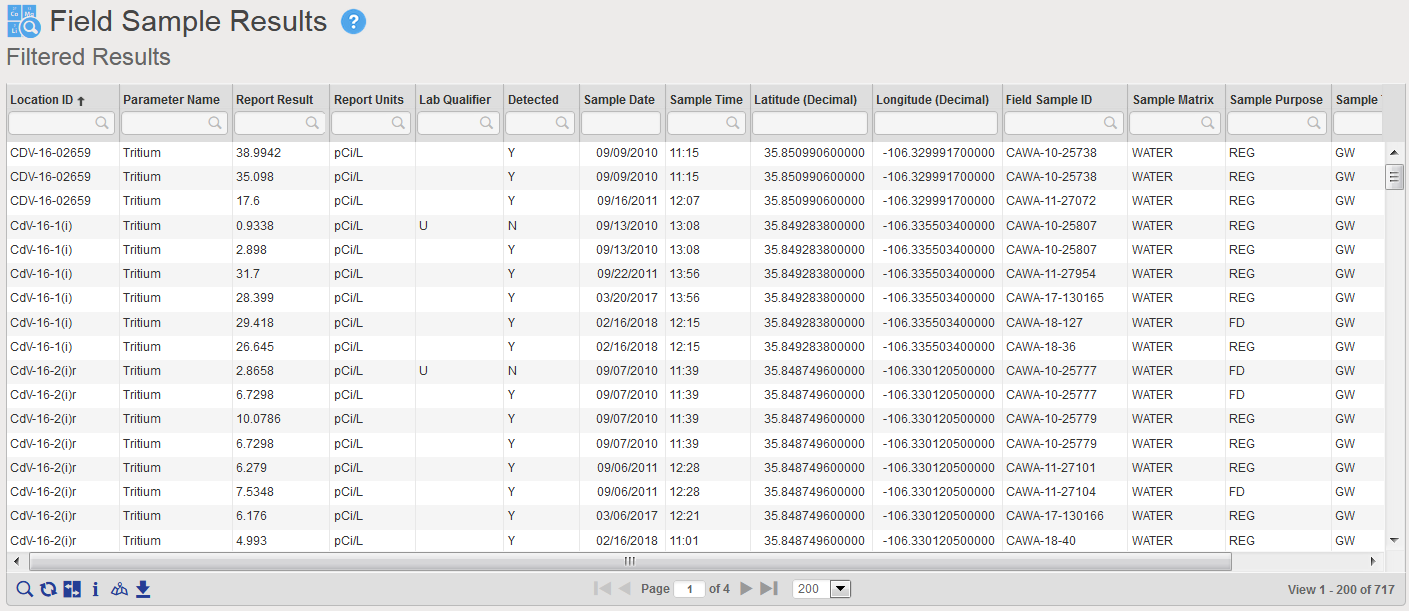
First let’s just look at an export of all the data. Using the analysis functions in EIM, you search for all tritium concentrations from monitoring wells for the past ten years. EIM sends the results to a table as shown in Figure 1.

Tabular view of Tritium query results in Locus EIM

Figure 1 Tabular view of Tritium query results

The table has 717 results for multiple wells. It is very difficult to see overall patterns here, either spatially or temporally. Each of the 717 results is one item, and if you try to scroll and sort the table to see if tritium is increasing or decreasing over time, your working memory is quickly overwhelmed. This is where a good data visualization can help.

Producing helpful visualizations of your sample tritium data

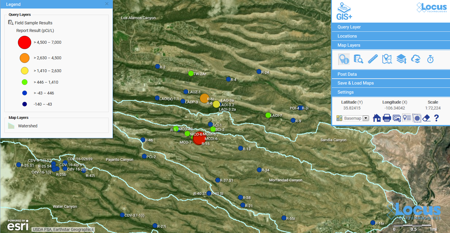
To start, you decide to send the data to the Locus GIS+ application, using the graduated color and size options. The GIS+ takes the concentrations from the results table and plots them on a site map using the stored coordinates for each well, as shown in Figure 2. The map represents each location with a symbol that is colored and sized to reflect the actual maximum value at that location. The map legend shows you how this was done. Large red circles, for example, represent results from 4,500 to 7,000 pCi/L. As the sizes get smaller, and the colors go from red to blue, the actual result gets smaller.

Graduated symbol and color map in Locus EIM

Figure 2 Graduated symbol and color map of tritium concentrations

This map is great for showing spatial patterns in the data. You can easily pick out a couple of “areas of concern” near the center of the map – one with orange and yellow circles, and another with red circles. To revisit our discussion on working memory and chunks, the map takes the 717 results and summarizes them so your brain can quickly pick out the two areas of concern.

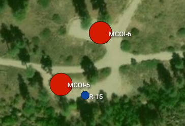
Let’s look more closely at the area of concern with higher results. If we zoom in on the map, we see the two red locations are wells MCOI-5 and MCOI-6 as shown in Figure 2.

Zoomed map for one area of concern in Locus GIS+

Figure 3 Zoomed map for one area of concern

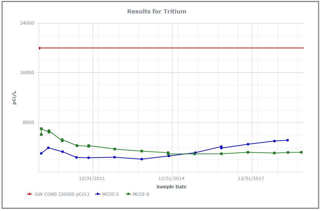
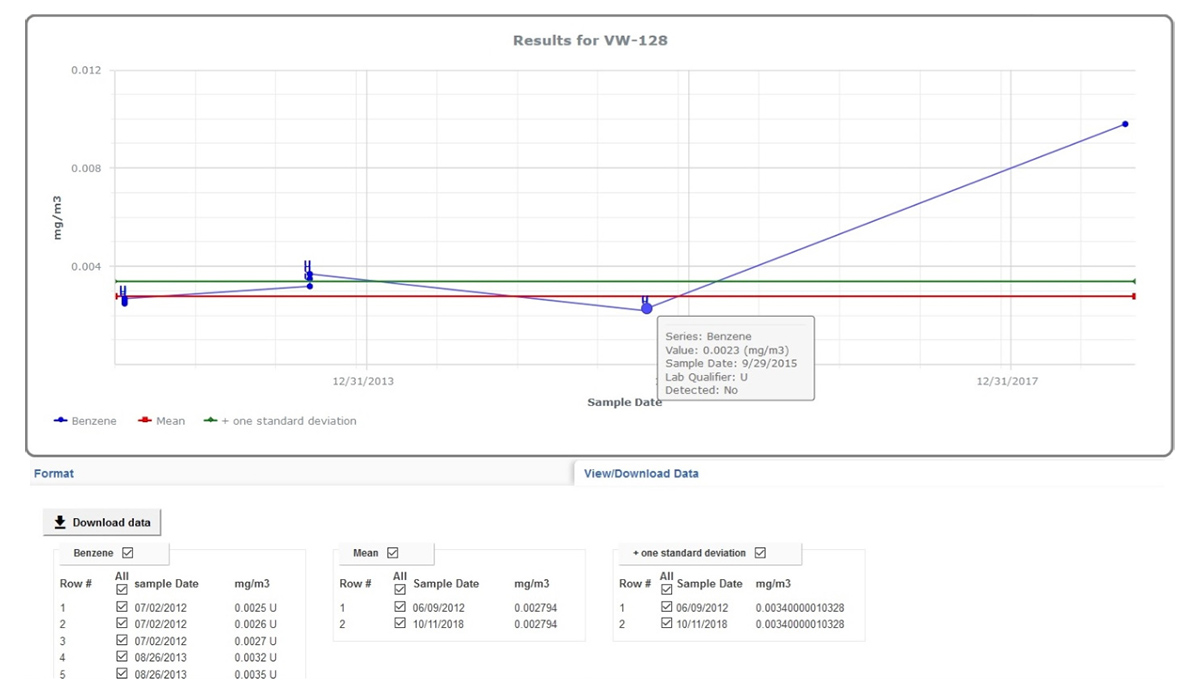
The map shows you where these two high concentrations of tritium are located. But what if you want to see how the concentrations vary over time? You can make a time series chart in EIM for these wells and include a desired regulatory limit, as shown in Figure 4. The green and blue lines represent the tritium concentrations over time for the two wells. The red line at top shows a regulatory action limit.

Line chart in Locus EIM

Figure 4 Line chart showing time series for tritium for two wells, with action limit

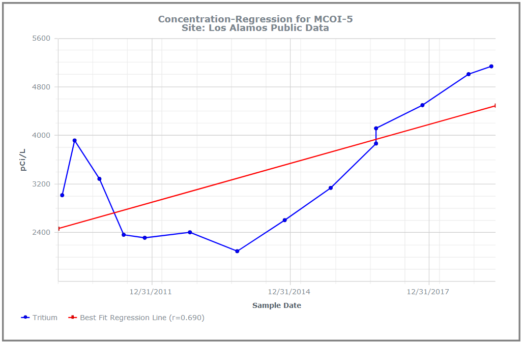
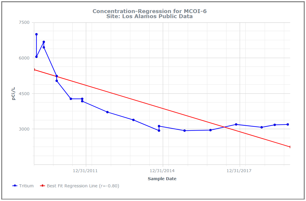
The chart shows you two important things. First, and most importantly, all the tritium concentrations for both wells lie well below the regulatory action limit! Second, the concentrations have very different trends for the two wells: MCOI-6 started higher but has trended lower, while MCOI-5 started below MCOI-6 but has now surpassed it. You can confirm these general impressions by running concentration regression charts in EIM for the two locations, as shown in Figure 5. The charts show the best fit regression line and the strength of the relation.

Regression chart in Locus EIM Regression chart in Locus EIM

Figure 5 Concentration regression charts in EIM

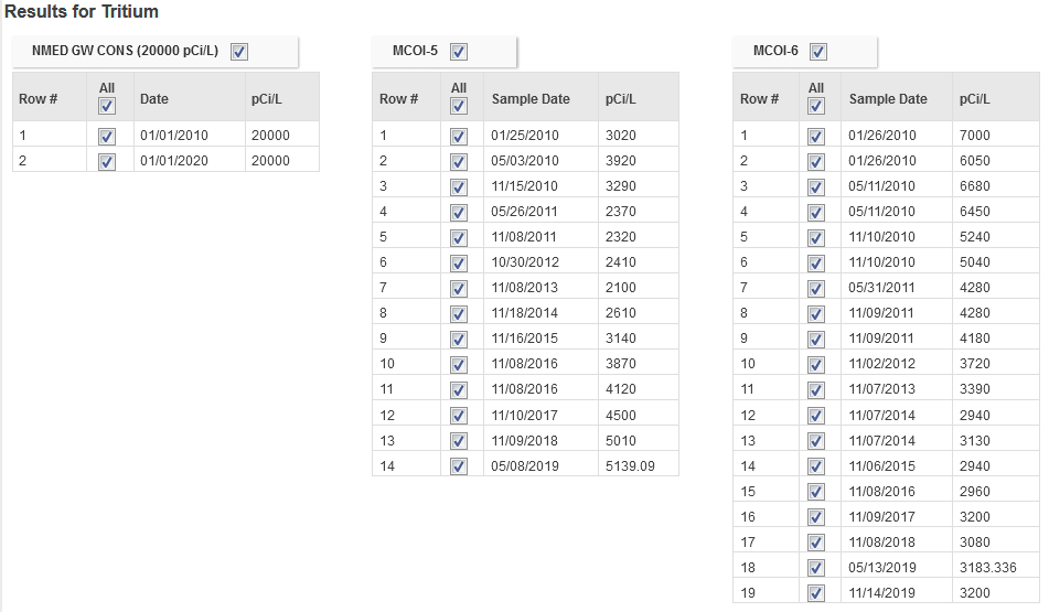
You can grasp these facts quickly because the of how the chart works. Each series of concentrations for a well consists of multiple data items that are ‘chunked’ into one line on the chart. There are two many individual data points on this chart for your working memory, but only three lines, which can easily be manipulated in your brain. For comparison, Figure 6 shows the actual data values for the chart. The time trends shown above in the charts are not as obvious from the table.

Data values in Locus EIM

Figure 6 Actual data values for the chart in Figure 4

Enhancing the visualization with sample tritium values

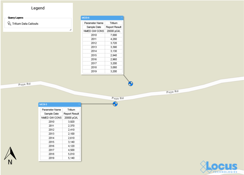
Now, this might be counter-intuitive, but what if you wanted to put some of these values on the map? While visualizations do help understand data, sometimes it can be useful to have the data shown as well so viewers can see where the visualizations came from. The EIM Data Callouts function can do this. Figure 7 shows data callouts for the two wells. Each callout shows the maximum annual tritium result for 2010-2020. Now you have the actual tritium concentrations located spatially next to the matching wells!

Data callouts in Locus GIS+

Figure 7 Data Callouts in EIM GIS+

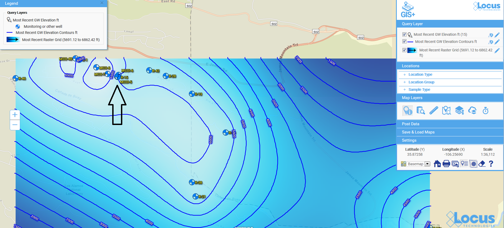
Now that you know where your tritium might be a concern, suppose you want to see what’s going on with groundwater at your site. The EIM contouring module does that for you. There are multiple contouring options, but for this example let’s use the default options for kriging. We know from Figure 2 that the wells MCOI-5 and MCOI-6 are located in the Mortandad Canyon. Figure 8 shows the contouring map generated from EIM for the groundwater wells in that canyon, using the most recent groundwater levels. Higher groundwater values are lighter in color than lower values.

The area of concern is marked with an arrow at upper left. The contour lines and values can help you determine how the tritium might migrate in your site. Imagine trying to picture this just using tables of groundwater readings! With the contour map, the readings turn into lines that can be chunked together for analysis: the higher levels at the upper left forming a “plateau”, the closely packed lines moving across the map to the east, and then the “saddle” area at lower right. These different line patterns carry particular meanings to engineers and scientists who interpret contour maps.

Contour map for groundwater in Locus GIS+

Figure 8 Contour map for groundwater levels

The contour map completes our tour of some of the visualization tools in EIM. Because visualizations let you chunk items together, you can look at the ‘big picture” and not get lost in tables of data results. Your working memory stays within its capacity, your analysis of the information becomes more efficient, and you can gain new insights into your data.

Acknowledgments: All the data in EIM used in the examples was obtained from the publicly available chemical datasets online at Intellus New Mexico.

Learn more about Locus EIM.


About the Author—Dr. Todd Pierce, Locus Technologies

Dr. Pierce manages a team of programmers tasked with development and implementation of Locus’ EIM application, which lets users manage their environmental data in the cloud using Software-as-a-Service technology. Dr. Pierce is also directly responsible for research and development of Locus’ GIS (geographic information systems) and visualization tools for mapping analytical and subsurface data. Dr. Pierce earned his GIS Professional (GISP) certification in 2010.
An EHS&S Look Into the Tech Used in the Iowa Caucuses

The Importance of User Implementation and Quality Assurance from an EHS&S Software Provider

After reading about the IowaReporterApp used during the 2020 Iowa caucuses, it struck me how remarkably similar it is in intended function to the EHS&S software developed by my employer, Locus Technologies. Both their application and Locus’ mobile technology collect large quantities of sensitive data from several remote users at multiple facilities, allowing for instant calculation and reporting. What surprised me though, is just how vastly different their user implementation and data management methodology was from what is standard operating procedure at Locus.

In this blog, I will highlight some of the pitfalls of the IowaReporterApp, and compare it to Locus’ EHS&S software. Note, this article is not a political critique, but is an examination of data collection and data quality methods used during the caucuses.

Complex data - Data stewardship

Implementation

Users were introduced to the IowaReporterApp just days before the caucuses and received no app-specific training. Many users were downloading the application on the night of the caucuses.

The Iowa caucuses have been held biennially for almost a half-century as the first major contest of the primaries. The date of the caucuses was a surprise to no one. As a result, app development deadlines should have given enough time for user implementation, through one-on-one training or presentations with appropriate support staff. If app deadlines were not met, there should have been a fallback to redundant reporting systems, like in the case of Nevada, who were also planning to use the app but have opted out after the debacle in Iowa.

When Locus introduces new users to our software, we take implementation seriously. Our customer support team is composed of domain experts who have actively built and used Locus software. We know the deadlines and the problems users typically face during the implementation process. From one-on-one and on-site training to quick turnaround, our support team does everything they can to ensure that users are comfortable with our product as soon as possible.

Complex data - Software quality assurance

Untested Software/Quality Assurance

User implementation deadlines are all the more important given that the software had no real-world use to this point. While it is not advisable to go live with untested software, at the very least, having users stress test a product before field-use could have staved off a few issues.

This is something we see frequently with newer products and newer companies. Locus has over 20 years of experience creating EHS&S software used by U.S. government organizations and Fortune 500 companies. Our quality assurance team rigorously tests any update we bring to customers and doesn’t rush changes to sell a platform update, since every user is always on the same version of Locus software.

Complex data - Data redundancy

Data Redundancy

No one can question that Excel or Google Spreadsheets can perform math correctly, but what is frequently overlooked or not even considered, are the macros, custom functions, and calculations that are often added to spreadsheets when deployed for managing data and other tasks. If one fails, there need to be backups for reporting and storing data.

When the untested application predictably failed, users flocked to the phone lines as a redundancy. Manual data collection on such a scale created confusion and could not carry the load, and had no way of accounting for errors in data entry. At Locus, we understand the importance of EHS&S data, and maintain backups and full audit trails for all critical data, with quick restoration available so you can keep going if anything should happen.

Complex data - Security

Security

The IowaReporterApp was not released in time to get approval in Apple’s app store, and it was sent out through beta testing platforms which required suspension of smartphone security settings.

ProPublica, a nonprofit organization who produces public interest investigative journalism, did a report on the security of the IowaReporterApp after the Iowa Caucuses. Shockingly, they found security problems to be “elementary” and that the app was so insecure that vote totals, passwords, and other sensitive information could have been intercepted or changed. Luckily, there seems to be no evidence of hacking or tampering with results.

Locus understands the need for security with sensitive data, and hosts our entire infrastructure in the most secure and reliable cloud, Amazon Web Services. AWS has an unmatched portfolio of cloud services that Locus fully utilizes to the benefit of their customers.

Complex data - Data entry

Summary

Overall, I think that the mishaps related to the IowaReporterApp show just how easy it is for a data collection and management application to fail if not properly implemented and ran by those with years of practical expertise. Subverted data quality will always be extremely costly to your organization, both financially and otherwise, and should be avoided unequivocally.


Locus Technologies was founded in 1997. Locus’ environmental data management software currently handles over a half billion sensitive records taken from over one million unique locations and is used hundreds of organizations including the government agencies and Fortune 500 companies. Aaron Edwards received his bachelor’s degree in Political Science from UNC Asheville and is Marketing Associate for Locus Technologies. He is an active voter, and is unaffiliated with any political party.

Why Locus?

How to extend your EHS software with integrated systems

Integration with other systems, whether on-premises or in the cloud, has become a key wishlist item for many EHS software buyers. It allows you to take advantage of other tools used by your organization (or available from third parties) to simplify processes, access information, and enhance communication, both internally and externally.

Top 10 Enhancements to Locus Environmental Software in 2019

Let’s look back on the most exciting new features and changes made in EIM, Locus’ environmental data management software, during 2019!

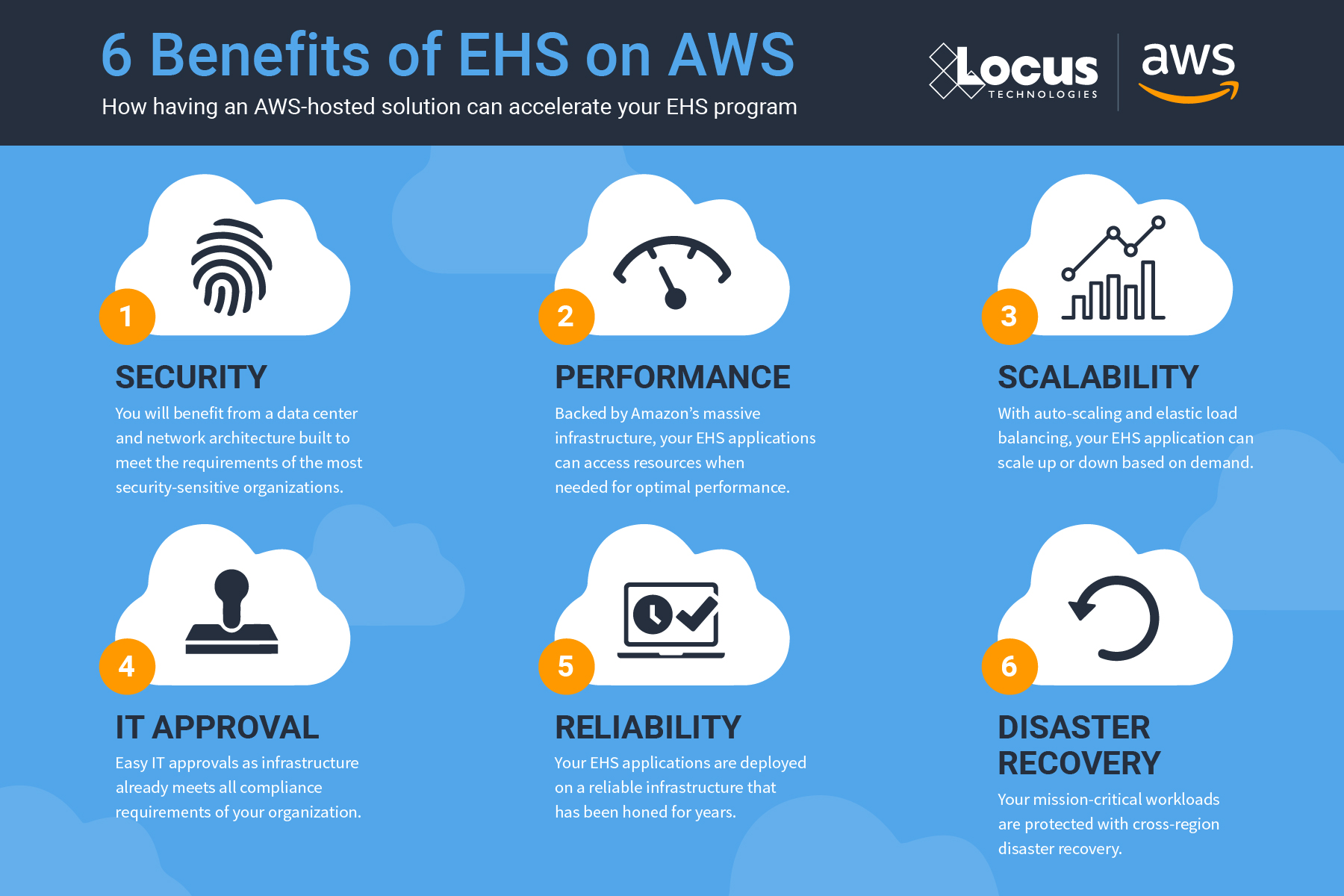
1. Migration to AWS Cloud

In August, Locus migrated EIM into the Amazon Web Services (AWS) cloud. EIM already had superior security, reliability, and performance in the Locus Cloud. The move to AWS improves on those metrics and allows Locus to leverage AWS specific tools that handle big data, blockchain, machine learning, and data analytics. Furthermore, AWS is scalable, which means EIM can better handle demand during peak usage periods. The move to AWS helps ensure that EIM remains the world’s leading water quality management software.

Infographic: 6 Benefits of EHS on AWS

2. SSO Login

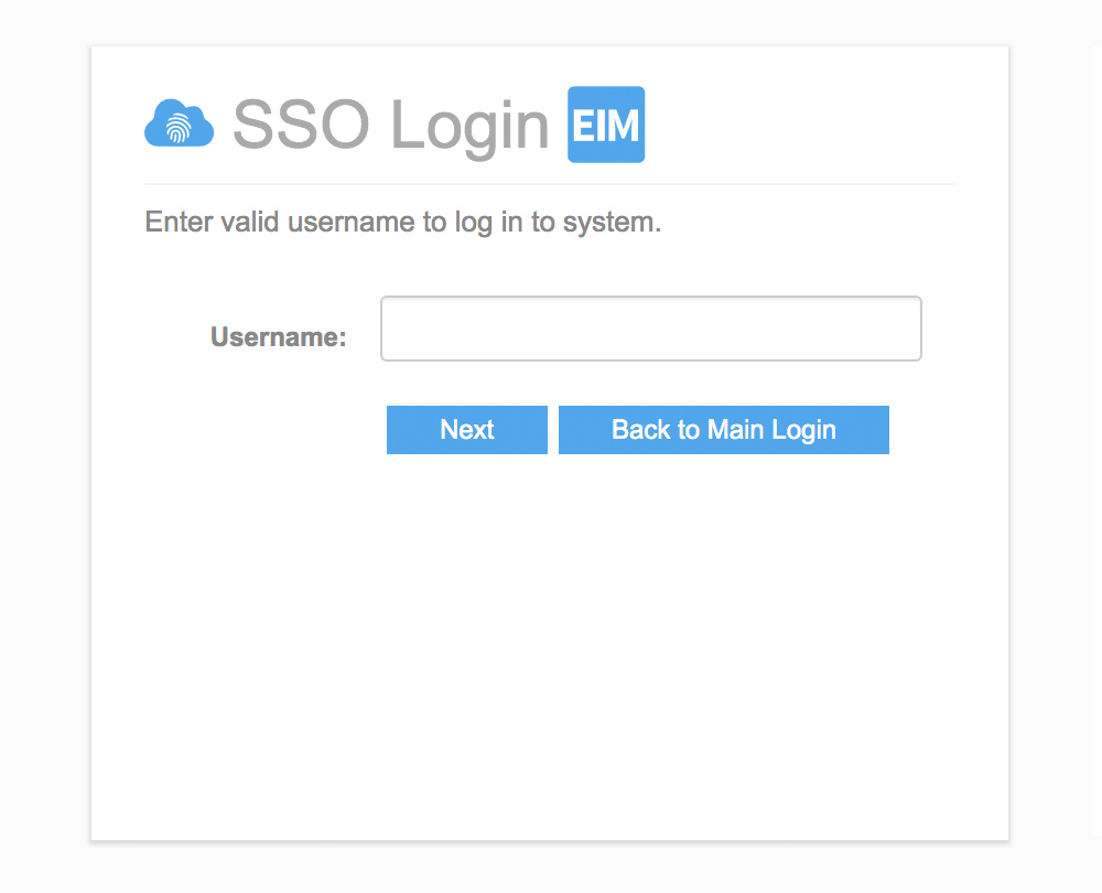
EIM now supports Single Sign-On (SSO), allowing users to access EIM using their corporate authentication provider. SSO is a popular security mechanism for many corporations. With SSO, one single login allows access to multiple applications, which simplifies username and password management and reduces the number of potential targets for malicious hacking of user credentials. Using SSO with EIM requires a one-time configuration to allow EIM to communicate with a customer’s SSO provider.

Locus Single Sign On (SSO)

3. GIS+ Data Callouts

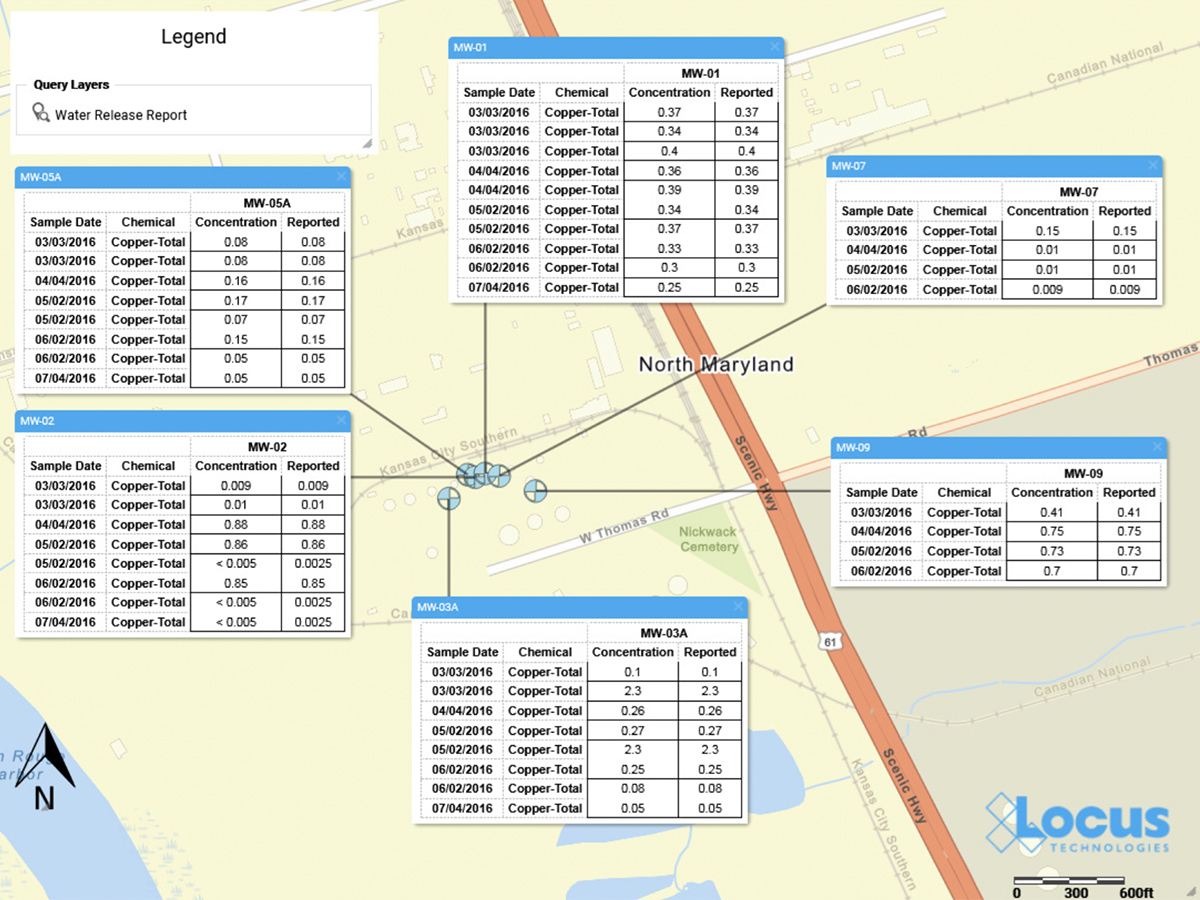
The Locus GIS+ solution now supports creating data callouts, which are location-specific crosstab reports listing analytical, groundwater, or field readings. A user first creates a data callout template using a drag-and-drop interface in the EIM enhanced formatted reports module. The template can include rules to control data formatting (for example, action limit exceedances can be shown in red text). When the user runs the template for a specific set of locations, EIM displays the callouts in the GIS+ as a set of draggable boxes. The user can finalize the callouts in the GIS+ print view and then send the resulting map to a printer or export the map to a PDF file.

Locus GIS+ Data Callouts

4. EIM One

For customers who don’t require the full EIM package, Locus now offers EIM One, which gives the ability to customize EIM functionality. Every EIM One purchase comes with EIM core features: locations and samples; analytical and field results; EDD loading; basic data views; and action limit exceedance reports. The customer can then purchase add-on packages to get just the functionality desired–for example a customer with DMR requirements may purchase the Subsurface and Regulatory Reporting packages. EIM One provides customers with a range of pricing options to get the perfect fit for their data management needs.

EIM One Packages

5. IoT data support

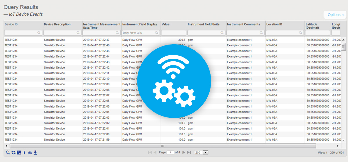
EIM can now be configured to accept data from IoT (internet of things) streaming devices. Locus must do a one-time connection between EIM and the customer’s IoT streaming application; the customer can then use EIM to define the devices and data fields to capture. EIM can accept data from multiple devices every second. Once the data values are in EIM, they can be exported using the Expert Query tool. From there, values can be shown on the GIS+ map if desired. The GIS+ Time Slider automation feature has also been updated to handle IoT data by allowing the time slider to use hours, minutes, and seconds as the time intervals.

Locus IoT Data

6. CIWQS and NCDEQ exports

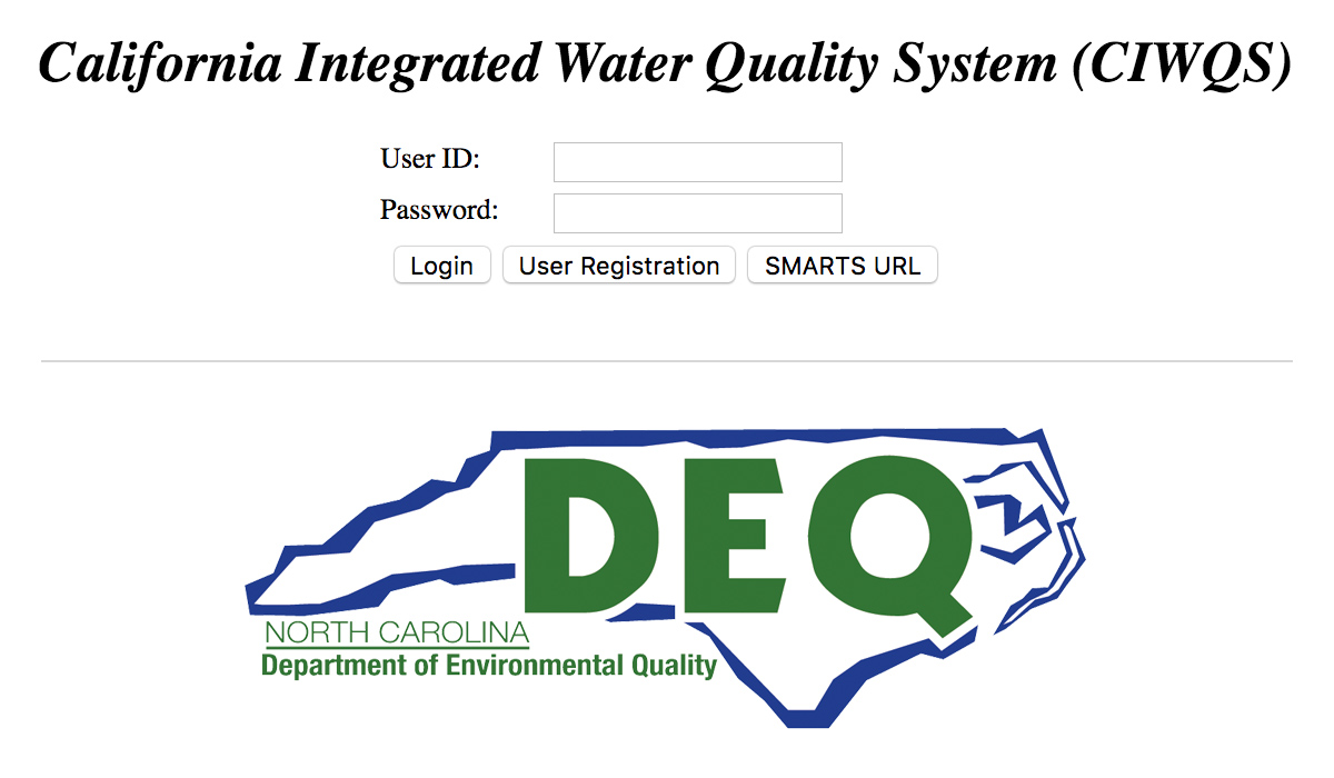
EIM currently supports several dozen regulatory agency export formats. In 2019, Locus added two more exports for CIWQS (California Integrated Water Quality System Project) and the NCDEQ (North Carolina Department of Environmental Quality). Locus continues to add more formats so customers can meet their reporting requirements.

CIWQS and NCDEQ Exports

7. Improved Water Utility reporting

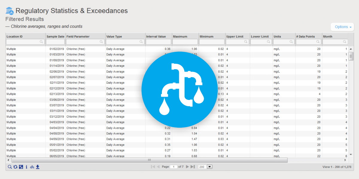
EIM is the world’s leading water quality management software, and has been used since 1999 by many Fortune 500 companies, water utilities, and the US Government. Locus added two key reports to EIM for Water in 2019 to further support water quality reporting. The first new report returns chlorine averages, ranges, and counts. The second new report supports the US EPA’s Lead and Copper rule and includes a charting option. Locus will continue to enhance EIM for Water by releasing the 2019 updates for the Consumer Confidence Report in January 2020.

Locus Water Utility Reporting

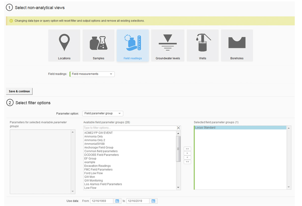
8. Improved Non-Analytical Views

Locus continues to upgrade and improve the EIM user interface and user experience. The most noticeable change in 2019 was the overhaul of the Non-analytical Views pages in EIM, which support data exports for locations, samples, field readings, groundwater levels, and subsurface information. Roughly 25 separate pages were combined into one page that supports all these data views. Users are directed through a series of filter selections that culminate in a grid of results. The new page improves usability and provides one centralized place for these data reports. Locus plans to upgrade the Analytical Views in the same way in 2020.

Non-analytical views in Locus EIM

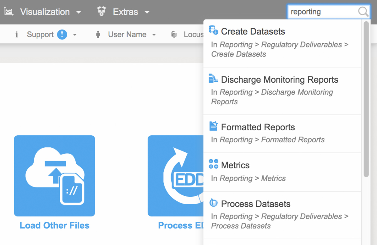
9. EIM search box

To help customers find the correct EIM menu function, Locus added a search box at the top right of EIM. The search box returns any menu items that match the user’s entered search term. In 2020, Locus will expand this search box to return matching help file documents and EDD error help, as well as searches for synonyms of menu items.

Locus EIM Quick Search

10. Historical data reporting in EDD loading

The EIM EDD loader now has a new “View history” option for viewing previously loaded data for the locations and parameters in the EDD. This function lets users put data in the EDD holding table into proper historical context. Users can check for any unexpected increases in parameter concentrations as well as new maximum values for a given location and parameter.

Historical Data in Locus EIM