By Catherine Heanue, Senior Engineering Manager
Reading Time: 4 minutes 30 seconds
TL;DR: Locus Technologies presented at the 2026 Battelle Conference on how its EIM software brings historical context directly into the PFAS laboratory data validation workflow. Rather than reviewing data only at the Sample Delivery Group (SDG) level, the platform embeds automated charting, statistical QA/QC analysis, and machine learning-based outlier detection into the Electronic Data Deliverable (EDD) process. The result is faster identification of laboratory performance trends, treatment system anomalies, and data quality issues — before data is committed to production systems.

Locus Technologies recently presented at the 2026 Battelle Conference on Remediation of Chlorinated and Recalcitrant Compounds as part of the Multisite Portfolios: Optimizing Data Management session. Our presentation, “Intelligent Automation for Quantitative Data Validation of PFAS Laboratory Data,” showcased how automation, visualization, and machine learning can enhance the review and validation of environmental laboratory data.
As organizations manage increasing volumes of PFAS and other environmental monitoring data, the challenge is no longer simply storing information; the challenge is to quickly identify trends, anomalies, and potential quality concerns. Our presentation focused on how Locus Environmental Information Management (EIM) software integrates historical analytics directly into the Electronic Data Deliverable (EDD) workflow, allowing users to evaluate incoming data in the context of years of historical records.
Moving Beyond Traditional SDG Validation
Laboratory data validation has traditionally been performed at the Sample Delivery Group (SDG) level. While this approach remains effective for batch-specific quality assurance and quality control (QA/QC), it offers limited visibility into long-term laboratory performance and historical trends.
To address this gap, Locus has embedded historical charting, statistical analysis, and automated data review tools directly into the EDD processing workflow. Users can now evaluate incoming PFAS laboratory results against historical datasets before data is finalized, providing additional context during the validation process.
The visualizations demonstrated at the Battelle conference included:
- Matrix Spike/Matrix Spike Duplicate (MS/MSD) control charts with statistical limits
- Raw and treated water PFAS concentration charts with action limits
- Laboratory QA/QC charts for:
- Duplicates
- Laboratory Control Samples
- Method Blanks
- Matrix Spikes
- Machine learning-based outlier detection for:
- Analytical data
- Field measurements
- Groundwater elevation data
The objective is simple: provide meaningful visual insights on as much data as possible, as quickly as possible, with minimal user effort.
Integrating Visualization into the EDD Workflow
When laboratory data is uploaded into Locus EIM, it first enters a staging area where automated validation checks confirm that incoming values align with standardized database configurations.
After these initial checks, the data can undergo additional validation against laboratory QA/QC criteria, allowing qualifiers to be assigned where appropriate.
At any point during review, users can launch contextual visualizations directly from the EDD interface. This allows reviewers to compare incoming results against historical records, identify first-time detections, evaluate laboratory performance trends, and investigate unusual results before the data is committed to production tables.
A key design principle guided the development of these tools: one click should provide meaningful insight. Every charting interface is automatically populated with relevant information from the uploaded EDD, eliminating the need for manual setup.
Monitoring Laboratory Performance with MS/MSD Control Charts
One example presented at the conference was the automated MS/MSD control chart workflow.
When launched from an EDD, the system automatically selects:
- Parameters included in the upload
- Laboratories with historical MS/MSD data
- Associated analytical methods
- A default historical review period
With a single additional click, users can generate charts for every selected parameter simultaneously. In many cases, this means producing more than a dozen charts in seconds.
The charts display historical recovery performance along with laboratory acceptance limits, making it easy to identify long-term trends that may not be visible during routine SDG review.
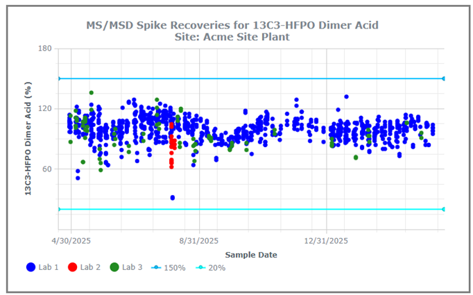
This functionality was originally developed in response to a client’s concern regarding a laboratory whose recovery values gradually declined over time. Although individual batches remained within acceptance criteria, the long-term trend raised questions about analytical performance. By incorporating historical control charts directly into the validation workflow, such trends become immediately visible during every data upload.
Evaluating PFAS Treatment Performance
Another workflow demonstrated at the conference focused on PFAS treatment monitoring.
These charts compare raw and treated water concentrations against site-specific action limits and are automatically configured using information contained within the uploaded EDD, including:
- Monitoring locations
- Applicable action limits
- Relevant PFAS analytes
- Sample classifications
Users can generate multiple chart types across multiple chemicals simultaneously, creating a comprehensive view of treatment performance with minimal effort.
The charts also include client-requested visualization enhancements such as:
- Distinct symbols for non-detect results
- Action limit indicators
- Treatment system maintenance events, such as GAC changeouts
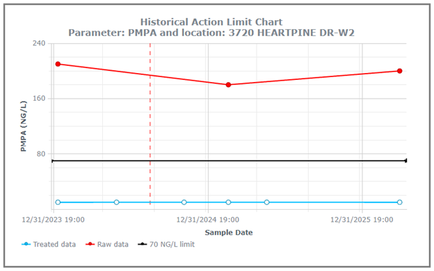
This enables users to quickly determine when treatment performance begins to decline and proactively schedule maintenance before exceedances occur.
Automated Laboratory QA/QC Visualization
Locus also demonstrated a generalized laboratory QA/QC charting package that supports multiple sample purposes and analytical workflows.
Because EDDs often contain different sample categories, available methods and parameters automatically update based on the selected sample purpose. Users can then generate a complete set of QA/QC charts with a single action.
Examples include:
Field Duplicate Charts
Field duplicate charts display the most recent data points from both pending and finalized datasets, allowing users to compare incoming results against recent historical performance.
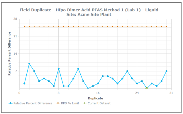
Current upload data is highlighted, making it immediately clear where new measurements fall relative to established trends.
Laboratory Control Sample Charts
Laboratory Control Sample (LCS) charts display historical recovery performance alongside upper and lower acceptance limits.
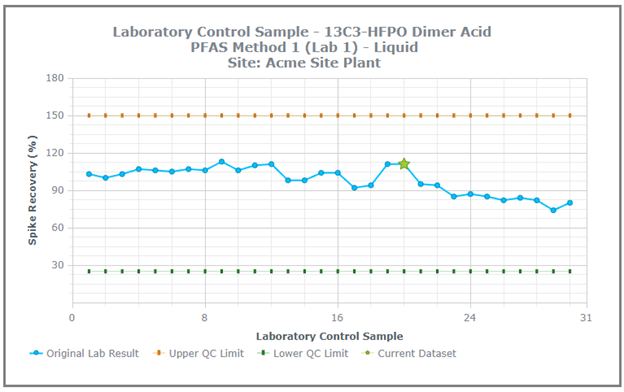
Users can quickly determine whether current analytical performance is consistent with historical expectations, providing an additional layer of confidence during data review.
Applying Machine Learning to Data Review
The final capability discussed at the Battelle conference was machine learning-assisted outlier detection within the EDD workflow.
This functionality leverages the open-source Prophet forecasting model to generate expected value ranges and confidence intervals from historical data. While the approach can be applied to analytical results, it has proven especially valuable for groundwater elevation monitoring datasets.
The model identifies observations that fall outside expected ranges and flags them for further review.
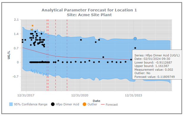
Importantly, the system is designed to support—not replace—human expertise. Potential outliers are presented to reviewers along with supporting information and field notes, allowing users to determine whether the observation represents a true anomaly, a valid environmental change, or a data quality issue.
This human-in-the-loop approach combines the efficiency of machine learning with the judgment and domain knowledge of experienced environmental professionals.
Streamlined Review and Reporting
Once charts are generated, users can review results through a multi-tab interface that supports both visualization and data exploration.
All chart data and associated metadata can be exported into a single Excel workbook, while visual outputs can be downloaded as:
- Individual PNG images
- Consolidated PDF reports
Formatting preferences can be saved as reusable templates, allowing organizations to standardize reporting and rapidly generate large volumes of visual output.
Key Takeaways
These enhancements to Locus EIM and the EDD workflow yield several important benefits:
- Improved visibility into laboratory-specific QA/QC performance
- Earlier identification of positive and negative analytical trends
- Better assessment of overall data usability
- Enhanced detection of issues that may not be apparent through traditional SDG-based validation alone
- Faster review of large environmental datasets
By integrating historical visualization, automated analytics, and machine learning directly into the EDD workflow, organizations gain additional context precisely when it is most valuable—during data review and validation. The result is a faster, more informed validation process that helps environmental professionals identify trends, anomalies, and potential concerns before data enters production systems.
FREQUENTLY ASKED QUESTIONS
Q: How does this approach improve on traditional laboratory data validation for PFAS programs?
Traditional validation is performed at the SDG level, which is effective for batch-specific QA/QC but offers limited visibility into long-term laboratory performance. Locus EIM embeds historical charting, statistical analysis, and automated review tools directly into the EDD workflow, allowing incoming PFAS results to be evaluated against years of historical records before data is finalized. This makes trends visible — such as gradual declines in laboratory recovery values — that would not be apparent through routine SDG review alone.
Q: Can the system detect problems with laboratory performance before they cause data quality failures?
Yes. The MS/MSD control chart workflow was specifically developed in response to a client’s concern about a laboratory whose recovery values gradually declined over time, even while individual batches remained within acceptance criteria. By automatically generating historical control charts for every parameter during each data upload, the system makes long-term performance trends immediately visible, enabling early intervention before results fall outside acceptance limits.
Q: How does machine learning fit into the validation workflow, and does it replace reviewer judgment?
A: The platform uses the open-source Prophet forecasting model to generate expected value ranges and confidence intervals from historical data, flagging observations that fall outside those ranges for further review. The system is explicitly designed to support human expertise rather than replace it; potential outliers are presented to reviewers alongside supporting information and field notes, allowing experienced professionals to determine whether a flagged result represents a true anomaly, a valid environmental change, or a data quality issue.
Locus is the only self-funded water, air, soil, biological, energy, and waste EHS software company that is still owned and managed by its founder. The brightest minds in environmental science, embodied carbon, CO2 emissions, refrigerants, and PFAS hang their hats at Locus, and they’ve helped us to become a market leader in EHS software. Every client-facing employee at Locus has an advanced degree in science or professional EHS experience, and they incubate new ideas every day – such as how machine learning, AI, blockchain, and the Internet of Things will up the ante for EHS software, ESG, and sustainability.