Tag Archive for: Mapping
Getting More from your Environmental Data using Dashboards with Integrated Mapping
Ready to use GIS software? Jump to the Locus GIS product page>
Today is GIS Day, a day started in 1999 to showcase the many uses of geographical information systems (GIS). Earlier Locus blog posts have explained how GIS and maps support visualization of objects in space and over time. This post covers a specific visualization method called data dashboards.
A data dashboard is a combination of charts, maps, text, and images that enables analysis of data and thereby promotes discovery of previously unknown relationships in the data. Companies and organizations use dashboards to develop insight into the overall status of a company or of a company division, process, or product line. Dashboards are also a common function in ‘business intelligence’ applications such as Microsoft Power BI and Tableau. A printed dashboard is static, but an online dashboard can be dynamic; in a dynamic dashboard, interacting with one item on the dashboard causes the other items to update. Taken together, the visualizations on a dynamic dashboard can help you find the story in your data.
One reason dashboards are so helpful is that they allow humans to partially ‘offload’ their thinking. Cognitive research has shown that human ‘working memory’ handles at most four items at a time. A good visualization, however, reduces the number of items to process in memory.
Consider a large table of carbon dioxide emissions by country for multiple years; it can be difficult to keep all the numbers in mind if you are trying to find trends.
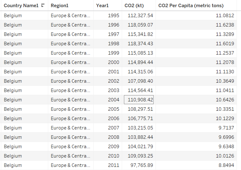
If you plot the data in a graph, however, each series of data in the chart becomes just one line on the graph. It is much easier to compare lines on the chart than to compare columns of numbers.
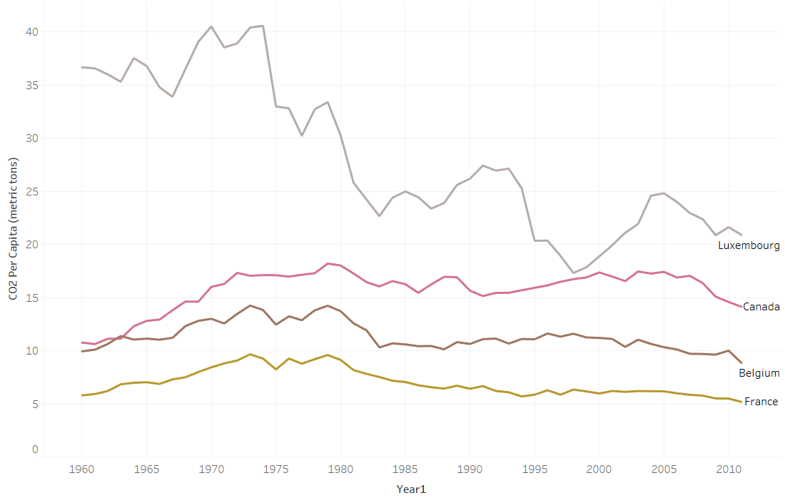
Now consider making a map with countries color coded by emissions. Again, for each country, the map reduces multiple numbers to a single color for that country on the map. You can compare country colors more easily than columns of numbers.
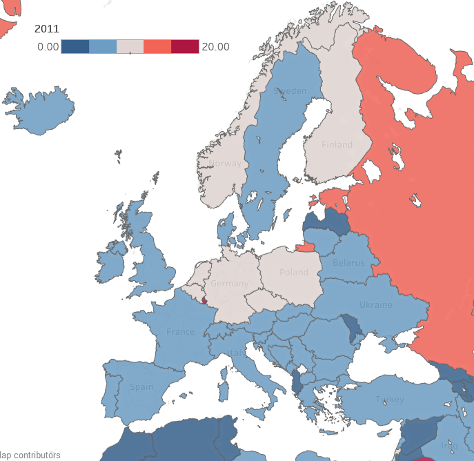
A dashboard that combines multiple visualizations further enhances data analysis. Imagine a dynamic dashboard showing you both the emissions chart and map described above. If you select a country on the map, the chart can highlight the line for that country, so you compare its emissions to other countries over time. Similarly, if you select a line on the chart for a specific country, the map can highlight the selected country to show how its emissions compare to nearby countries. This interactivity lets you drill into your data more effectively than using either the chart or the map by itself.
Here are three examples of effective dashboards that are available online:
- The Covid-19 dashboard from John Hopkins shows a map, charts, and tables of Covid -19 cases.
- The Global Climate Dashboard from NOAA shows charts of multiple climate indicators.
- The Carbon Pricing dashboard from the World Bank lets you drilldown to see carbon pricing initiatives for various nations.
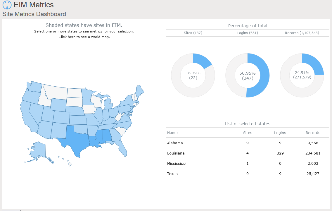
Locus includes data dashboards in our applications. One example is the Site Metrics dashboard in EIM, Locus’s cloud-based, software-as-a-service application for environmental data management. The Site Metrics dashboard lets you perform roll-up queries across your portfolio of sites. A map on the dashboard shows all states with active sites. If you select one or more states, the dashboard updates the charts and tables on the right to show total sites, user logins, and record counts. Other dashboards can support showing sample locations of certain chemicals or counts of regulatory limit exceedances.
A further example comes from the Locus Environmental Social and Governance (ESG) application. ESG metrics are becoming increasingly important measures for an organization’s performance. Data dashboards can help companies quickly visualize trends in their ESG metrics using intuitive mapping tools.
This dashboard illustrates both spatial and time trends and provides the raw data necessary for auditability and transparent decision making. Having these features on a single combined view provides users with instant access to the key inputs for ESG prioritization, planning, and project implementation.
As these examples from Locus show, data dashboards with integrated mapping are important tools for maximizing the value of your collected environmental and ESG data. For any dataset with a geographic component, it’s important to incorporate mapping elements in the outputs, to highlight trends and patterns that may not otherwise be visible in a chart or table. Modern software can combine these output formats in a way that tells the story shown by your data.
Interested in Locus’ GIS solutions?
Locus GIS+ features all of the functionality you love in EIM’s classic Google Maps GIS for environmental management—integrated with the powerful cartography, interoperability, & smart-mapping features of Esri’s ArcGIS platform!
Learn more about Locus’ GIS solutions.
About the Author—Dr. Todd Pierce, Locus Technologies
Dr. Pierce manages a team of programmers tasked with development and implementation of Locus’ EIM application, which lets users manage their environmental data in the cloud using Software-as-a-Service technology. Dr. Pierce is also directly responsible for research and development of Locus’ GIS (geographic information systems) and visualization tools for mapping analytical and subsurface data. Dr. Pierce earned his GIS Professional (GISP) certification in 2010.
The Convergence of Augmented Reality and GIS
Today is GIS Day, a day started in 1999 to showcase the many uses of geographical information systems (GIS). Earlier blog posts by Locus Technologies for GIS day have shown how GIS supports cutting-edge visualization of objects in space and over time. This year’s post explains how GIS supports augmented reality.
Augmented reality (AR) is a technology that enhances how we experience the real world by overlaying your surroundings with computer-generated objects. It differs from virtual reality (VR) because in VR, everything you see is computer generated, but in AR, the majority of what you see is real – your experience of reality is enhanced (augmented) but not totally replaced.
You are probably familiar with one AR application already if you watch American football. The ‘virtual’ first down line that appears on field before each play is projected there by computer and is not really painted on the field. If you follow soccer (or football to the rest of the world), AR is used by a Video Assistant Referee (VAR) to objectively determine tight offsides decisions. Digital lines are drawn across the field to show whether or not attackers are illegally past the last defender or not. Another AR example is the popular game Pokémon Go that shows cute virtual creatures in your living room or your front yard.
To experience AR, you need something to project the non-real objects onto your view of the world. Many AR applications use mobile phones or other devices. An AR application uses the camera view to show you the world around you and then overlays virtual objects onto the view. Other devices such as head mounted displays, ‘smart glasses’, or even ‘bionic contact lenses’ can use AR, but have not been as popular as phones or other mobile devices. In contrast to AR, VR cannot be fully supported with just a mobile device and usually requires headsets to immerse you in a virtual world. Because of this need, AR is much less intrusive than VR is.
Countless other examples of AR already exist in many fields. A few selected applications include:
- Online shoppers at some e-commerce sites can use smart devices to project furniture into their home to see how the pieces look before making a purchase.
- Some clothing stores can project clothing onto shoppers’ bodies to check appearance without having to change clothes. These applications require the user to be in a special dressing booth with full body scanning capabilities.
- Urban planners use AR to display how planned buildings, cell towers, wind turbines, and other structures would look in the existing space. Planners can walk the streets and view how proposed projects would alter the existing cityscape.
- AR is used in manufacturing to display operation and safety instructions in a worker’s field of vision using head mounted displays, which circumvents the need to refer to bulky paper manuals.
- Utility managers can see underground pipelines, water lines, sewer pipes, electrical lines, and other infrastructure projected below their feet.
So how does GIS relate to AR? There are three main uses of GIS in AR:
- Location: Any AR application must know where the user is and where to place virtual objects. In most cases, full GIS capabilities are not needed; instead, the application accesses a GPS (global positioning system) to find locations. Consider the Pokémon Go application mentioned before. The game knows where the various Pokémon need to appear. When a user plays the game, it uses GPS to find the user, and then shows any Pokémon that are near the user based on their locations.
- Layers: An AR application may need to show features that are not visible to the user, such as underground electrical lines, earthquake fault lines, property lines, or planned buildings. All these features can be stored as GIS map layers in the cloud and then displayed in the AR application as virtual overlays projected on the real world. Furthermore, a user could select a displayed item and view related attribute information in the GIS layer. For example, a user could view the condition, age, and repair status of a selected water pipeline.
- Navigation: An AR application may also need to help a user get from point A to point B, for example in a crowded airport or in a large warehouse. Such navigation could be facilitated by showing virtual route markers and arrows on the real world.
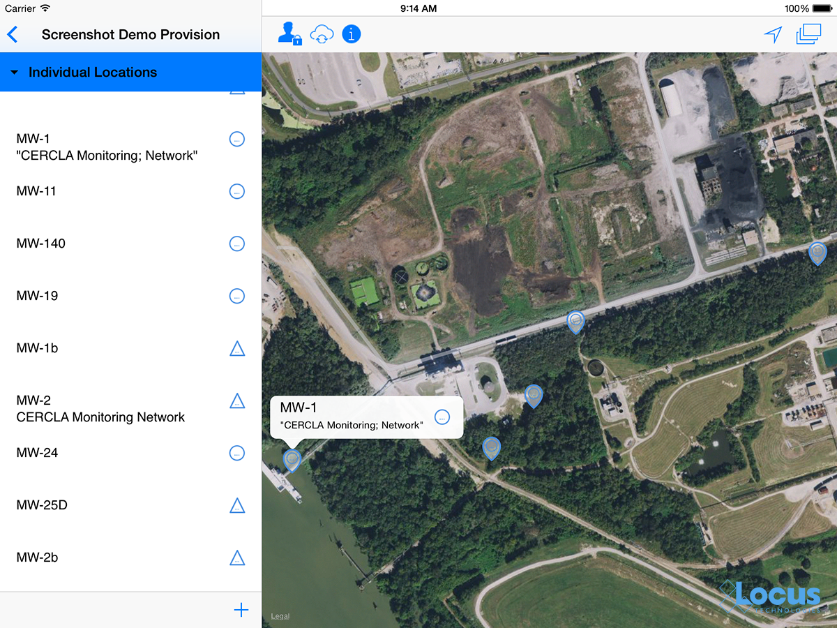
Locus has been exploring environmental uses of AR and GIS by adding AR to Locus Mobile, which is the Locus app for collecting field data, completing EHS audits, tracking waste containers, and completing other tasks requiring users to gather data out of the office. Locus Mobile now features an AR mode to assist users when taking field samples. When the user activates AR mode, the app uses the camera to show the user’s immediate area. The app then puts multiple virtual markers on the display corresponding to sampling points located in that direction. As the user moves or rotates the phone to change the viewing area, the markers change to reflect the locations in the user’s line of sight. Clicking a marker provides more information including the location name and the distance from the user.
Locus Mobile uses all three ways to combine GIS with AR:
- By using GPS to find the user’s location and the locations of nearby sampling points.
- By using GIS to display the layer of sampling points.
- By using GIS to assist with navigation to sampling points by showing distance and direction.
Here is a sample image from Locus Mobile showing three nearby sampling locations along with information about past events or measurements at the locations. The three blue banners are the augmented reality displayed on top of the view of the nearby surroundings.
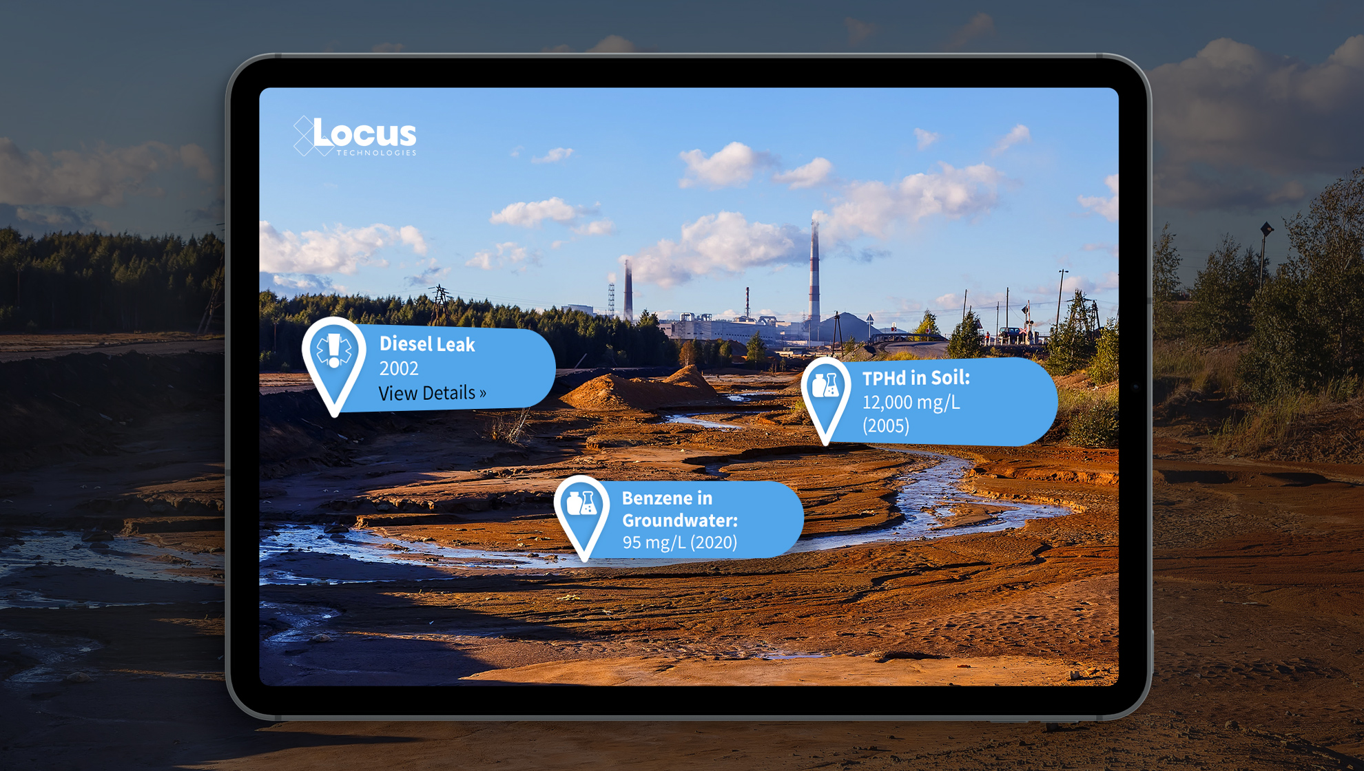
By using GIS and AR to assist users in finding sampling points, Locus Mobile makes field personnel more productive. Samplers can find field locations quickly and can easily pull up related information. Locus continues to explore using AR to expand the functionality of its environmental applications.
Interested in Locus’ GIS solutions?
Locus GIS+ features all of the functionality you love in EIM’s classic Google Maps GIS for environmental management—integrated with the powerful cartography, interoperability, & smart-mapping features of Esri’s ArcGIS platform!
Learn more about Locus’ GIS solutions.
About the Author—Dr. Todd Pierce, Locus Technologies
Dr. Pierce manages a team of programmers tasked with development and implementation of Locus’ EIM application, which lets users manage their environmental data in the cloud using Software-as-a-Service technology. Dr. Pierce is also directly responsible for research and development of Locus’ GIS (geographic information systems) and visualization tools for mapping analytical and subsurface data. Dr. Pierce earned his GIS Professional (GISP) certification in 2010.
Utilizing the Uniqueness of GIS for Better Environmental Data Analysis
Today is GIS Day, a day started in 1999 to showcase the many uses of geographical information systems (GIS). Earlier Locus blog posts have shown how GIS supports cutting-edge visualization of objects in space and over time. This post is going to go “back to basics” and discuss what makes GIS unique and how environmental data analysis benefits from that uniqueness.
Spatial vs Non-Spatial Relationships
So, what makes GIS unique? It’s the ability of GIS to handle spatial relationships, which goes beyond just putting “dots on a map”. You are probably familiar with non-spatial relationships such as greater than, less than, or equal to, and you probably use them every day. For example, suppose you want to buy the latest gaming console (PS5, anyone?). You need to compare the price of the console to your bank account. If the console price is greater than your savings, then you cannot buy the console.
Or can you? With credit cards, you can pay later, so you go charge the console. At the time of the transaction, some software evaluates a non-spatial relationship and checks if the console price plus your current debt is less than your credit limit. If so, you can buy the console; if not, your purchase is denied.
The key point about this example is that spatial relations play no part. It doesn’t matter where you are located or where the game console is sold from. (OK, there may be things like state taxes and shipping, but that just contributes to the price.) Now, if you were trying to find all gaming consoles for sale within a certain distance of you, that is a spatial relationship. There are multiple types of spatial relationship, but the most common are inside, contains, crosses, overlaps, and within a distance of. Standard relational database software does not handle these sorts of relations, but GIS can.
As an illustration, let’s consider two current events: the 2020 US presidential election and the COVID-19 pandemic. With non-spatial relationships, you can answer various questions such as “did Biden get more votes than Clinton?” or “is the number of positive COVID tests increasing?”. But with spatial relations, you can answer more interesting questions such as “did areas with COVID hot spots vote more predominantly for Biden or Trump?”. For this question you must see if voters lie inside a COVID hot spot; a GIS can perform this analysis and then map the results. While many votes are still being counted, as of this blog post, it appears Trump performed better in COVID hot spots.
Spatial Relationships in Environmental Data
Let’s look at some example of spatial relations in environmental data. Assume you have a database of tritium sampling results in water, along with various map layers of natural and manmade features. What kind of spatial relationships can you explore with GIS?
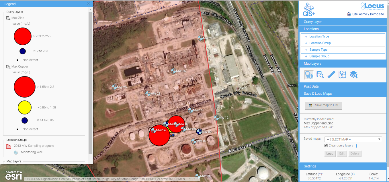
To answer that, we’ll make some maps with the Locus GIS+ package in EIM, Locus’s cloud-based, software-as-a-service application for environmental data management. All maps shown here display wells with tritium samples, with the wells represented as colored circles. The color scale goes from blue through yellow to red, to indicate increasing tritium results.
Figure 1 shows an example of an inside spatial relationship. The map answers the question “what wells with tritium results are inside the Mortandad Canyon watershed?”. The watershed is highlighted in blue on the map, and you can easily see the wells inside the watershed.
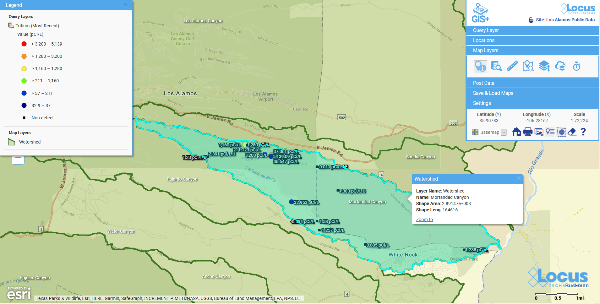
Figure 1: Wells with tritium within a watershed
Figure 2 shows wells with tritium results that are within a distance of a river. The map answers the question “what wells with tritium results are within 500 ft of the river?”. The river, highlighted in light blue, has a 500 ft buffer shown as a dotted blue line. The wells with tritium that lie within the buffer are shown on the map, so you can check if any high tritium results are close to the waterway.
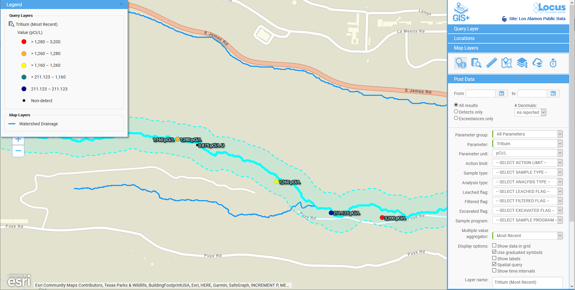
Figure 2: Wells with tritium within a specified distance of a river
Figure 3 shows another example of within a distance of. Here, the map answers the question “what wells with tritium results are within two miles of a middle school?”. The two-mile radius is shown as a shaded blue circle centered on the school. You can see the wells are confined to the area southeast of the school.
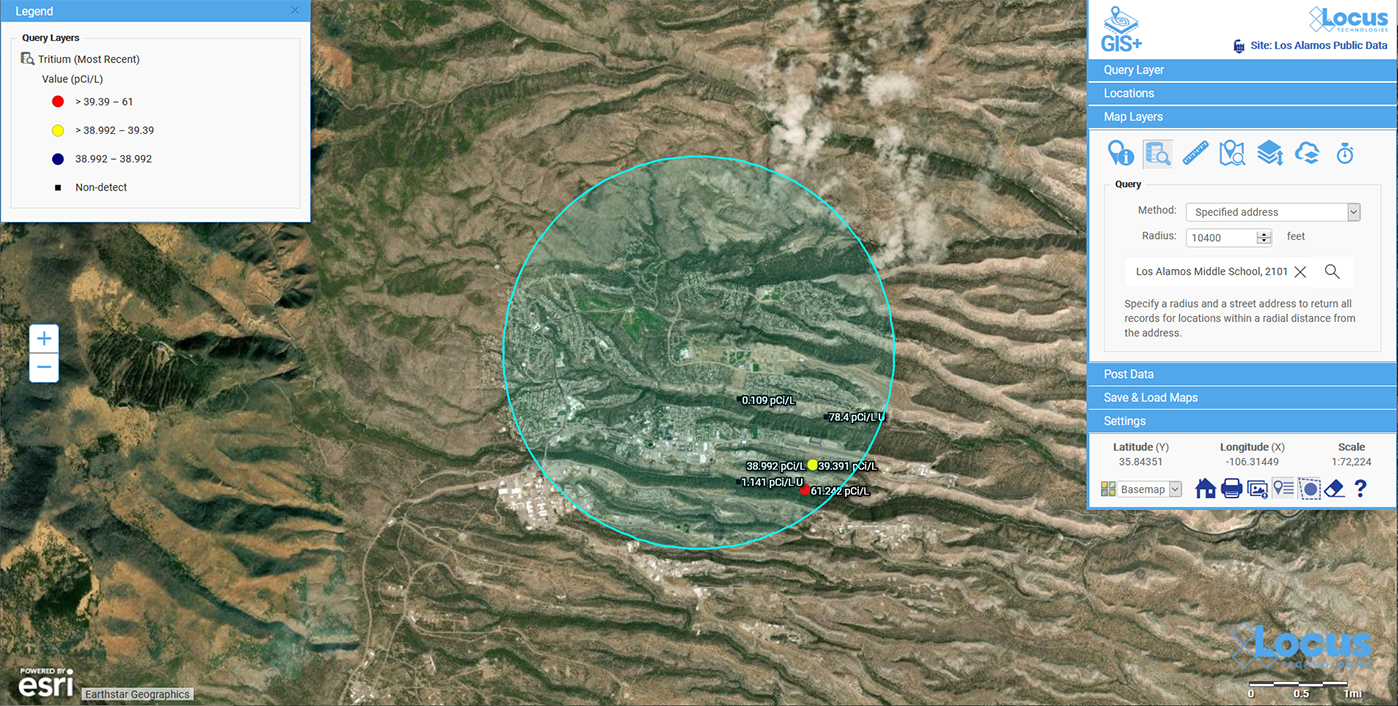
Figure 3: Wells with tritium within a specified distance of a school
These three examples are just a small subset of what can be done with GIS and environmental data. Here are some other questions illustrating the kind of spatial analysis that GIS supports.
- Have any spill incidents at my site been within a specified distance of a waterway?
- Do any pipelines at my site cross protected waterways?
- Do any remediation areas at my site contain wells that have recorded high chemical levels in water?
- Does the underground plume from a chemical release overlap any aquifers?
All these examples illustrate the power of GIS for analyzing spatial relationships, and these examples are just the beginning. GIS can also perform more sophisticated analyses that look at spatial relationships in different ways to answer questions such as:
- How confident can we be in the results of the spatial relationship analysis?
- Do all data records follow the spatial relationship, or are any outliers that fall outside the norms?
- Has this spatial relationship changed over time? Has the relation grown stronger or weaker?
- Can we predict the future of the spatial relationships?
Locus continues to bring new analysis tools to our Locus GIS+ system for environmental applications. These applications let you take advantage of the unique ability of GIS to analyze spatial relationships in your environmental data.
Acknowledgments: All the data in EIM used in the examples was obtained from the publicly available chemical datasets online at Intellus New Mexico.
Interested in Locus’ GIS solutions?
Locus GIS+ features all of the functionality you love in EIM’s classic Google Maps GIS for environmental management—integrated with the powerful cartography, interoperability, & smart-mapping features of Esri’s ArcGIS platform!
Learn more about Locus’ GIS solutions.
About the Author—Dr. Todd Pierce, Locus Technologies
Dr. Pierce manages a team of programmers tasked with development and implementation of Locus’ EIM application, which lets users manage their environmental data in the cloud using Software-as-a-Service technology. Dr. Pierce is also directly responsible for research and development of Locus’ GIS (geographic information systems) and visualization tools for mapping analytical and subsurface data. Dr. Pierce earned his GIS Professional (GISP) certification in 2010.
Mapping All of Space and Time
Today is GIS Day, a day started in 1999 to showcase the many uses of geographical information systems (GIS). To celebrate the passage of another year, this blog post examines how maps and GIS show time, and how Locus GIS+ supports temporal analysis for use with EIM, Locus’s cloud-based, software-as-a-service application for environmental data management.
Space and Time
Since GIS was first imagined in 1962 by Roger Tomlinson at the Canada Land Inventory, GIS has been used to display and analyze spatial relationships. Every discrete object (such as a car), feature (such as an acre of land), or phenomenon (such as a temperature reading) has a three-dimensional location that can be mapped in a GIS as a point, line, or polygon. The location consists of a latitude, longitude, and elevation. Continuous phenomenon or processes can also be located on a map. For example, the flow of trade between two nations can be shown by an arrow connecting the two countries with the arrow width indicating the value of the traded goods.
However, everything also has a fourth dimension, time, as locations and attributes can change over time. Consider the examples listed above. A car’s location changes as it is driven, and its condition and value change as the car gets older. An acre of land might start covered in forest, but the land use changes over time if the land is cleared for farming, and then later if the land is paved over for a shopping area. The observed temperature at a given position changes with time due to weather and climate changes spanning multiple time scales from daily to epochal. Finally, the flow of trade between two countries changes as exports, imports, and prices alter over time.
Maps and Time
Traditional flat maps already collapse three dimensions into two, so it’s not surprising that such maps do not handle the extra time dimension very well. Cartographers have always been interested in showing temporal data on maps, though, and different methods can be employed to do so. Charles Minard’s famous 1861 visualization of Napoleon’s Russian campaign in 1812-1813 is an early example of “spatial temporal” visualization. It combines two visuals – a map of troop movements with a time series graph of temperature – to show the brutal losses suffered by the French army. The map shows the army movement into Russia and back, with the line width indicating the troop count. Each point on the chart is tied to a specific point on the map. The viewer can see how troop losses increased as the temperature went from zero degrees Celsius to -30 degrees. The original thick tan line has decreased to a black sliver at the end of the campaign.
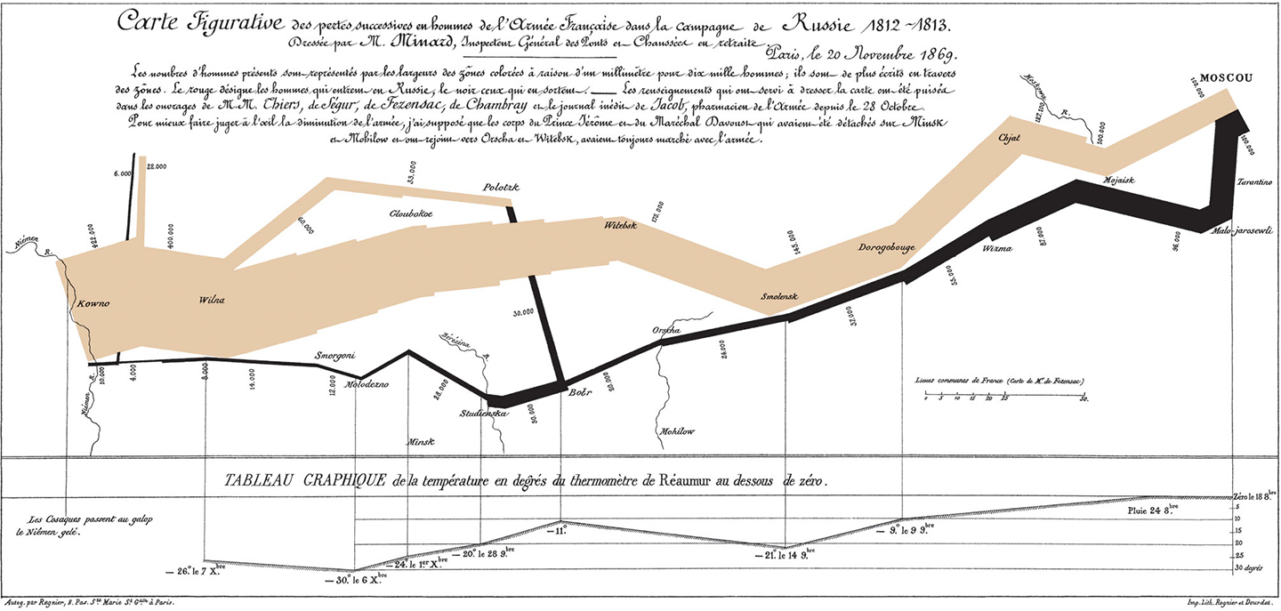
Charles Minard’s map of Napoleon’s Russian campaign in 1812-1813.
The Minard visual handles time well because the temperature chart matches single points on the map; each temperature value was taken at a specific location. Showing time changes in line or area features, such as roads or counties, is harder and is usually handled through symbology. In 1944, the US Army Corps of Engineers created a map showing historical meanders in the Mississippi River. The meanders are not discrete points but cover wide areas. Thus, past river channels are shown in different colors and hatch patterns. While the overlapping meanders are visually complex, the user can easily see the different river channels. Furthermore, the meanders are ‘stacked’ chronologically, so the older meanders seem to recede into the map’s background, similar to how they occur further back in time.
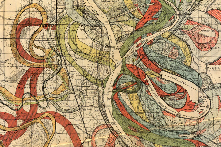
Inset from Geological Investigation of the Alluvial Valley of the Lower Mississippi River.
Another way to handle time is to simply make several maps of the same features, but showing data from different times. In other words, a temporal data set is “sliced” into data sets for a specific time period. The viewer can scan the multiple maps and make visual comparisons. For example, the Southern Research Station of the US Forest Service published a “report card” in 2011 for Forest Sustainability in western North Carolina. To show different land users over time, small maps were generated by county for three years. Undeveloped land is colored green and developed land is tan. Putting these small maps side by side shows the viewer a powerful story of increasing development as the tan expands dramatically. The only drawback is that the viewer must mentally manipulate the maps to track a specific location.
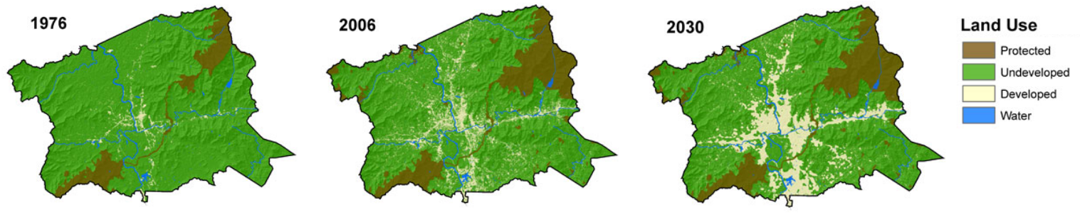
Land Use change over time for Buncombe County, NC
GIS and Time
The previous map examples prove that techniques exist to successfully show time on maps. However, such techniques are not widespread. Furthermore, in the era of “big data” and the “Internet of Things”, showing time is even more important. Consider two examples. First, imagine a shipment of 100 hazardous waste containers being delivered on a truck from a manufacturing facility to a disposal site. The truck has a GPS unit which transmits its location during the drive. Once at the disposal site, each container’s active RFID tag with a GPS receiver tracks the container’s location as it proceeds through any decontamination, disposal, and decommission activities. The locations of the truck and all containers have both a spatial and a temporal component. How can you map the location of all containers over time?
As a second example, consider mobile data collection instruments deployed near a facility to check for possible contamination in the air. Each instrument has a GPS so it can record its location when the instrument is periodically relocated. Each instrument also has various sensors that check every minute for chemical levels in the air plus wind speed and temperature. All these data points are sent back to a central data repository. How would you map chemical levels over time when both the chemical levels and the instrument locations are changing?
In both cases, traditional flat maps would not be very useful given the large amounts of data that are involved. With the advent of GIS, though, all the power of modern computers can be leveraged. GIS has a powerful tool for showing time: animation. Animation is similar to the small “time slice” maps mentioned above, but more powerful because the slices can be shown consecutively like a movie, and many more time slices can be created. Furthermore, the viewer no longer has to mentally stack maps, and it is easier to see changes over time at specific locations.
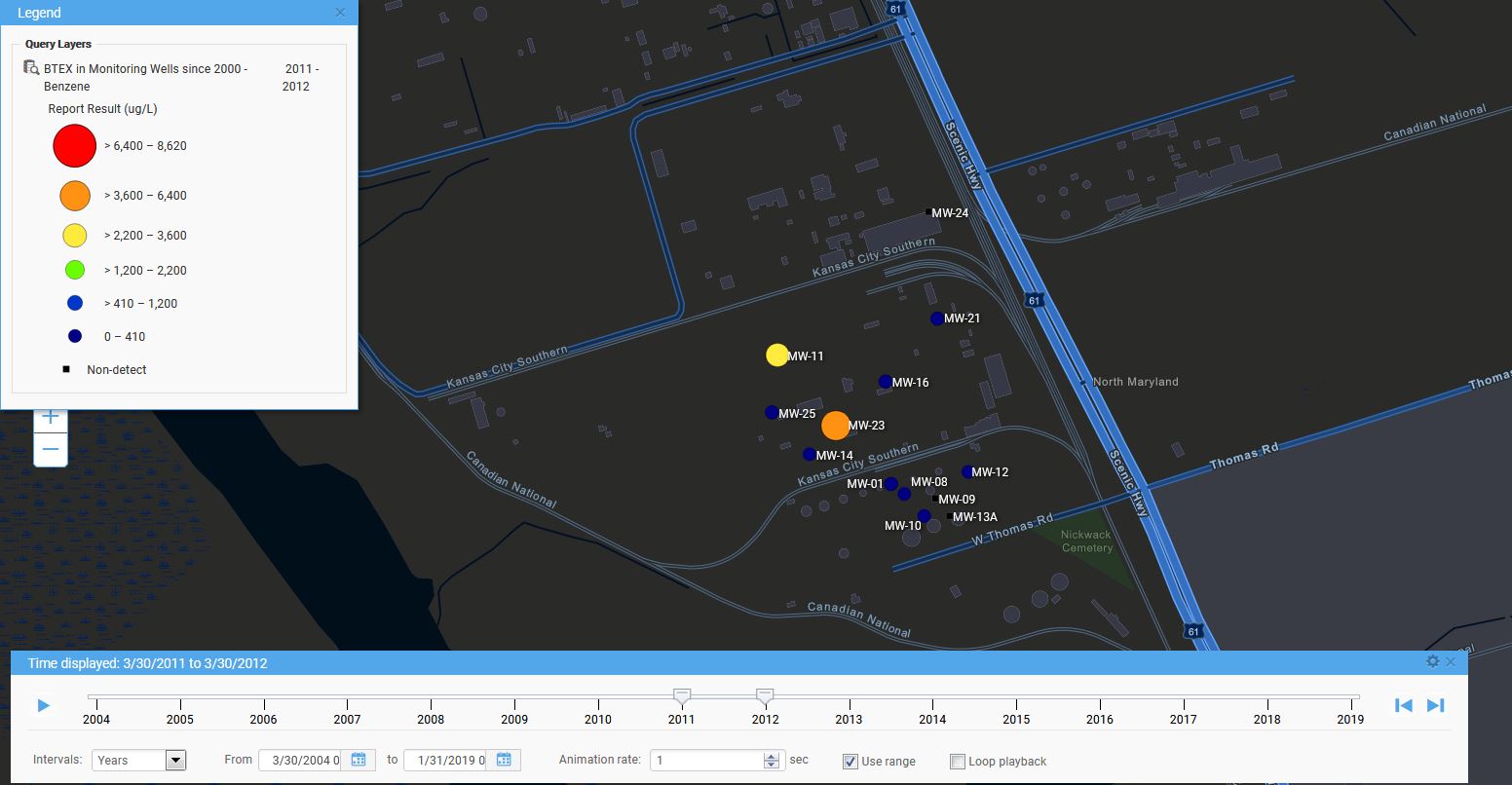
Locus has adopted animation in its GIS+ solution, which lets a user use a “time slider” to animate chemical concentrations over time. When a user displays EIM data on the GIS+ map, the user can decide to create “time slices” based on a selected date field. The slices can be by century, decade, year, month, week or day, and show the maximum concentration over that time period. Once the slices are created, the user can step through them manually or run them in movie mode.
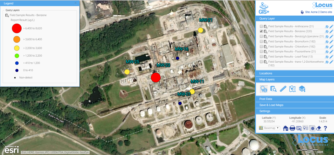
To use the time slider, the user must first construct a query using the Locus EIM application. The user can then export the query results to the GIS+ using the time slider option. As an example, consider an EIM query for all benzene concentrations sampled in a facility’s monitoring wells since 2004. Once the results are sent to the GIS+, the time slider control might look like what is shown here. The time slices are by year with the displayed slice for 3/30/2004 to 3/30/2005. The user can hit play to display the time slices one year at a time, or can manually move the slider markers to display any desired time period.

Locus GIS+ time slider
Here is an example of a time slice displayed in the GIS+. The benzene results are mapped at each location with a circle symbol. The benzene concentrations are grouped into six numerical ranges that map to different circle sizes and colors; for example, the highest range is from 6,400 to 8,620 µg/L. The size and color of each circle reflect the concentration value, with higher values corresponding to larger circles and yellow, orange or red colors. Lower values are shown with smaller circles and green, blue, or purple colors. Black squares indicate locations where benzene results were below the chemical detection limit for the laboratory. Each mapped concentration is assigned to the appropriate numerical range, which in turn determines the circle size and color. This first time slice for 2004-2005 shows one very large red “hot spot” indicating the highest concentration class, two yellow spots, and several blue spots, plus a few non-detects.
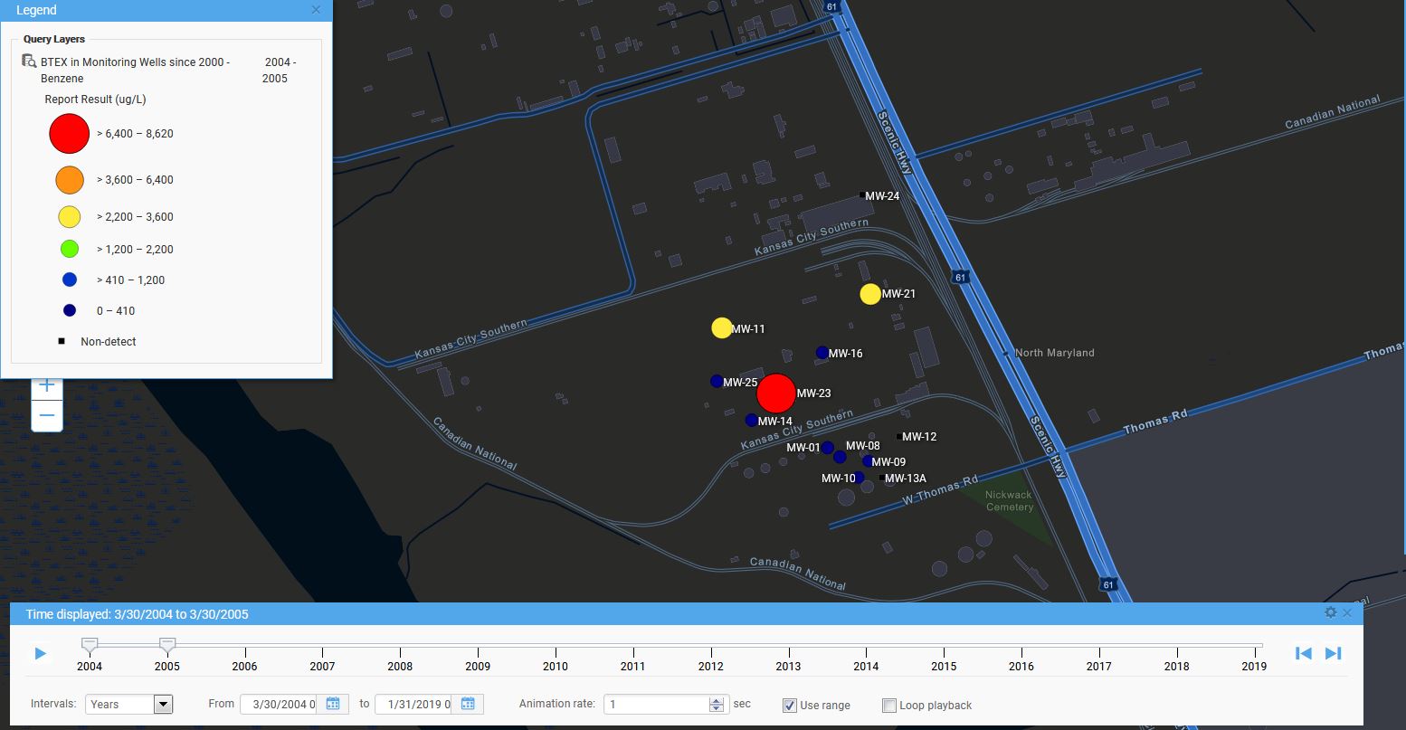
Time slice for a year for a Locus GIS+ query
Starting the time slider runs through the yearly time slices. As time passes in this example, hot spots come and go, with a general downward trend towards no benzene detections. In the last year, 2018-2019, there is a slight increase in concentrations. Watching the changing concentrations over time presents a clear picture of how benzene is manifesting in the groundwater wells at the site.
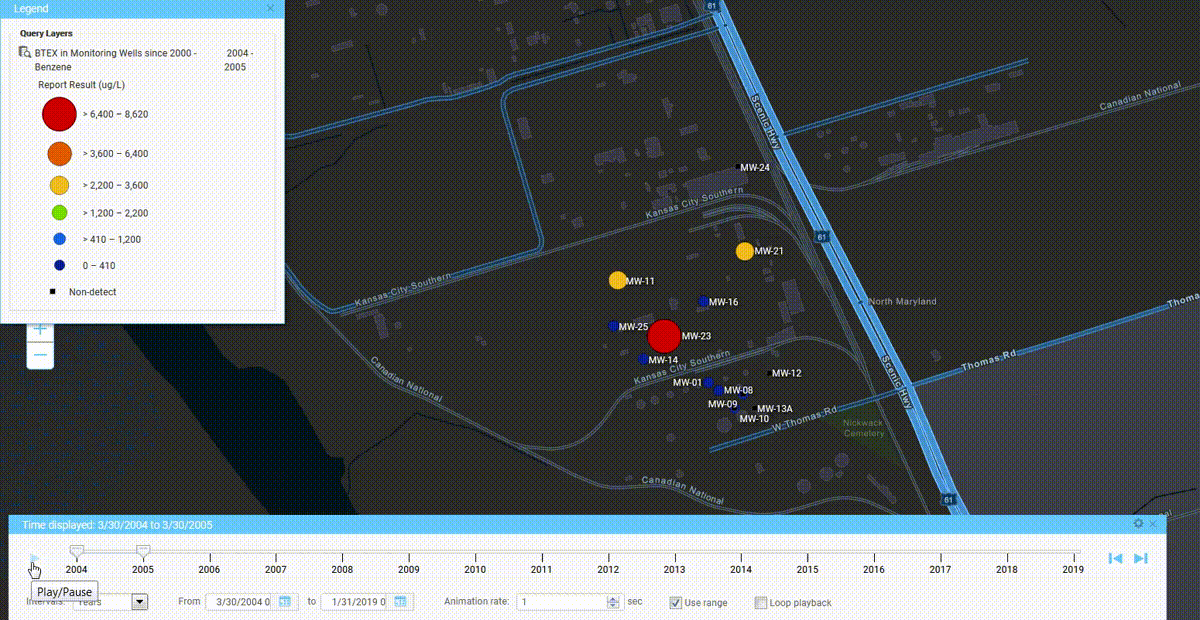
GIS+ time slider in action
While displaying time in maps has always been a challenge, the use of automation in GIS lets users get a better understanding of temporal trends in their spatial data. Locus continues to bring new analysis tools to their GIS+ system to support time data in their environmental applications.
Time slice for a Locus GIS+ query
Interested in Locus’ GIS solutions?
Locus GIS+ features all of the functionality you love in EIM’s classic Google Maps GIS for environmental management—integrated with the powerful cartography, interoperability, & smart-mapping features of Esri’s ArcGIS platform!
Learn more about Locus’ GIS solutions.
Dr. Pierce manages a team of programmers tasked with development and implementation of Locus’ EIM application, which lets users manage their environmental data in the cloud using Software-as-a-Service technology. Dr. Pierce is also directly responsible for research and development of Locus’ GIS (geographic information systems) and visualization tools for mapping analytical and subsurface data. Dr. Pierce earned his GIS Professional (GISP) certification in 2010.
Getting the most out of EHS mobile apps
Mobile tools for EHS have been around for some time now. By now, most users are familiar with the benefits such as instant data collection and access to reference information for better, more reliable EHS programs. However, as any tech-savvy individual knows, new software tools are consistently becoming more powerful and more accessible, and that is certainly true for mobile applications. That “ground-breaking” EHS mobile app that you purchased five years ago may now be looking a little dated if your software provider has not actively updated it. Here are some of the beyond-the-basic features that you probably really want, but perhaps never knew existed for your EHS mobile app.
Location metadata and mapping integration
Your coordinates are actively being recorded every time your phone moves. Why not record that data as part of an incident report or sample collection? Or use that information to locate the position of a monitoring well or other asset? Much of EHS information is associated to a specific location, so automatically storing your location can help ensure that you know where your data are originating.
You may be thinking that phone/tablet GPS is not very accurate, and you would be correct…..for now. According to GPS.gov, phone accuracy is typically accurate to within a 4.9 m (16 ft.) radius under open sky. While this may be accurate enough for some situations, it will not be sufficient for others. However, according to the IEEE, a respected technical engineering association, 2018 and beyond will bring new more accurate chips to phones that will improve GPS accuracy to about 30 centimeters, which should be much more useful for field locations especially when identifying the scene of a spill or accident.
So start thinking about what can be improved with your business process by getting more accurate location information, and start looking at upgrading mobile devices in the next year or two.
Barcode and QR code scanning
You are probably already using your phone to compare prices at your local store. It is amazingly easy to simply scan a product’s barcode and instantly see the best available price locally or online. Since virtually every phone/tablet now has a built-in camera, you can use that to scan barcodes or QR codes to associate data entry with a tagged location or asset. This can save you from possible mismatch errors that can occur when simply selecting from a list or typing in data.
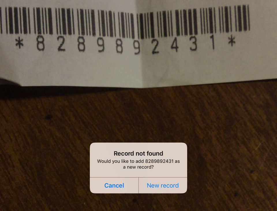
For users with thousands of locations/assets, it’s also a huge time saver when you can skip the long list of locations and just point and click. Moreover, for anyone tracking assets or even chemical inventory, barcodes are essential. In fact, many facilities have been using barcodes for years, but now they don’t need a specialized device. Barcodes or QR codes can be incorporated into mobile apps in new and unexpected ways to streamline business process and do more in the field with less physical overhead.
Therefore, the next time you are doing an audit, you can easily examine an instrument and immediately determine its calibration and maintenance status along with reporting any audit findings.
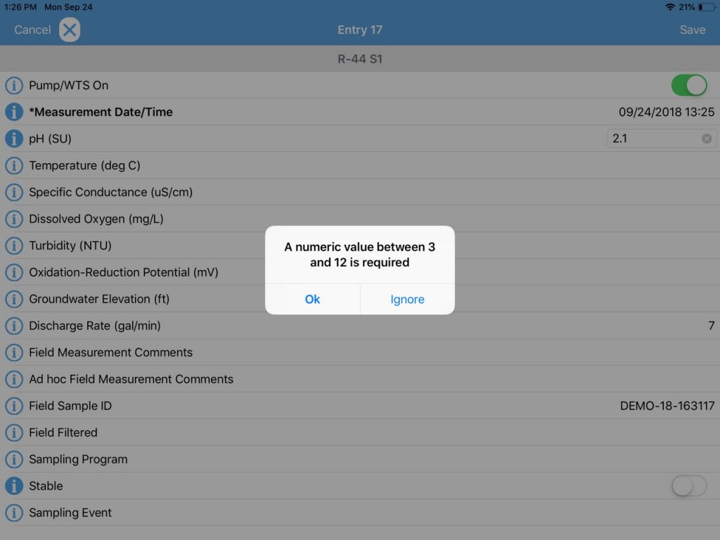
Real-time entry validation
It is not enough to just enter your EHS event information into a mobile device. You also want to make sure you are entering correct information. Modern EHS mobile tools can check your entry as you enter it, to match whatever criteria are established for that data. So you make sure that you’re entering a pH reading of 7.2, rather than 72. You can also use configurable pick lists to limit data entry to your specific desired entries and not have to deal with misspellings or 16 different ways to say “cloudy”. Make sure that pick lists are configurable and can be shared with each of your company’s devices.
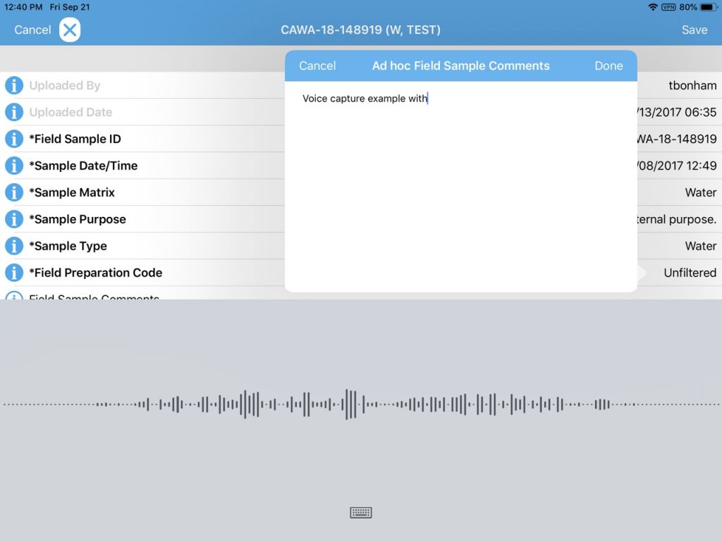
Use your voice
We are starting to use voice recognition technology in our mobile devices to quickly send out text messages. Why not use it for recording audit comments or field issues? Voice recognition is getting better and better every year, and can get your comments onto a data collection form much faster than typing and can be especially useful for conditions where gloves are required and typing or stylus input is not practical. Using the phone’s native abilities, take advantage of voice feature to streamline note taking knowing you can always fix up any issues back in the office.
Unique and custom forms
For many EHS programs, you may have your own data collection needs that are specific to your facility or industry. Mobile EHS apps now allow you to tailor your input forms to add new data fields, remove unwanted fields, change some of the logic like making certain fields required, and make certain fields tied into established pick lists. Even better, you can match the mobile form exactly to the original paper form, making the transition to mobile simple and intuitive for staff.
Along with form customization options, modern mobile apps let you have many different forms in one app, so the folks tracking waste shipments have their form, while to folks performing facility audits have their forms, which may be specific to the facility of the audit itself. One app with many forms greatly streamlines the training aspect of deploying mobile and gives EHS managers great flexibility to easily update forms when regulations change. Learn more.
Tips for choosing a GIS application for your environmental database
You can turbocharge your water data management by including a geographical information system (GIS) in your toolkit! Your data analysis efficiency also gets a huge boost if your data management system includes a GIS system “out of the box” because you won’t have to manually transfer data to your GIS. All your data is seamlessly available in both systems.
Ready to use GIS software? Jump to the Locus GIS product page>
Keep in mind that not all GIS packages are created equal. Here are some tips to consider when looking at mapping applications for your environmental data:
1) Confirm that integration is built-in and thorough
Mapping is easy when properly integrated with your environmental database. You should not need extra filters or add-on programs to visualize your data. Look for built-in availability of features, such as “click to map”, that take the guesswork and frustration out of mapping for meaningful results.
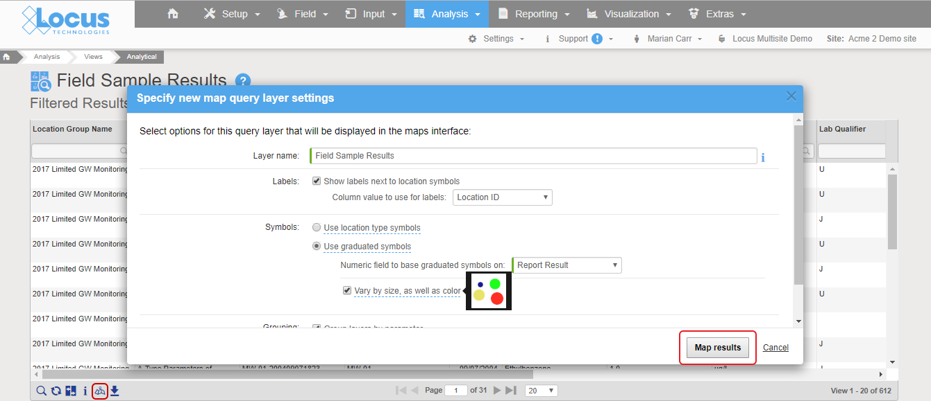
Good integration means mapping is as easy as clicking a “show on map” button. In Locus EIM, you can run a data query and click “Show results on map” icon, change the default settings if desired, and instantly launch a detailed map with a range of query layers to review all chemicals at the locations of interest.
All the query results are presented as query layers, so you can review the results in detail. This map was created with the easy “show results on map” functionality, which anyone can use with no training.
2) Check for formatting customization options
Look for easy editing tools to change the label colors, sizes, fonts, positioning, and symbols. Some map backgrounds make the default label styles hard to read and diminish the utility of the map, or if you’re displaying a large quantity of data, you’ll almost certainly need to tweak some display options to make these labels more readable.
Default label styles are legible on this background, but they are a bit hard to read.
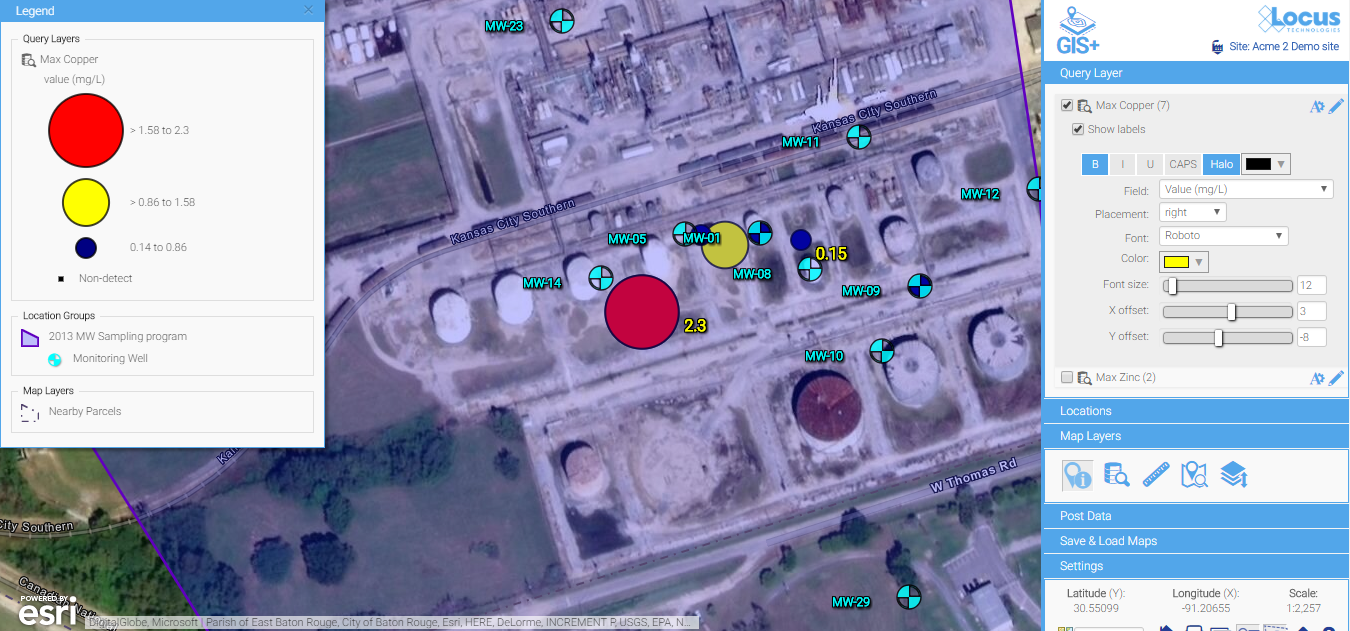
A few simple updates to the font color, font sizes, label offset, and background color make for much easier reading. Changes are made via easy-to-use menus and are instantly updated on the map, so you have total control to make a perfectly labeled map.
3) Look for built-in contouring for quick assessment of the extent of the spatial impact
Contours can be a great way to visually interpret the movement of contaminants in groundwater and is a powerful visualization tool. In the example below, you can clearly see the direction the plume is heading and the source of the problem. An integrated GIS with a contouring engine lets you go straight from a data query to a contour map—without export to external contouring or mapping packages. This is great for quick assessments for your project team.
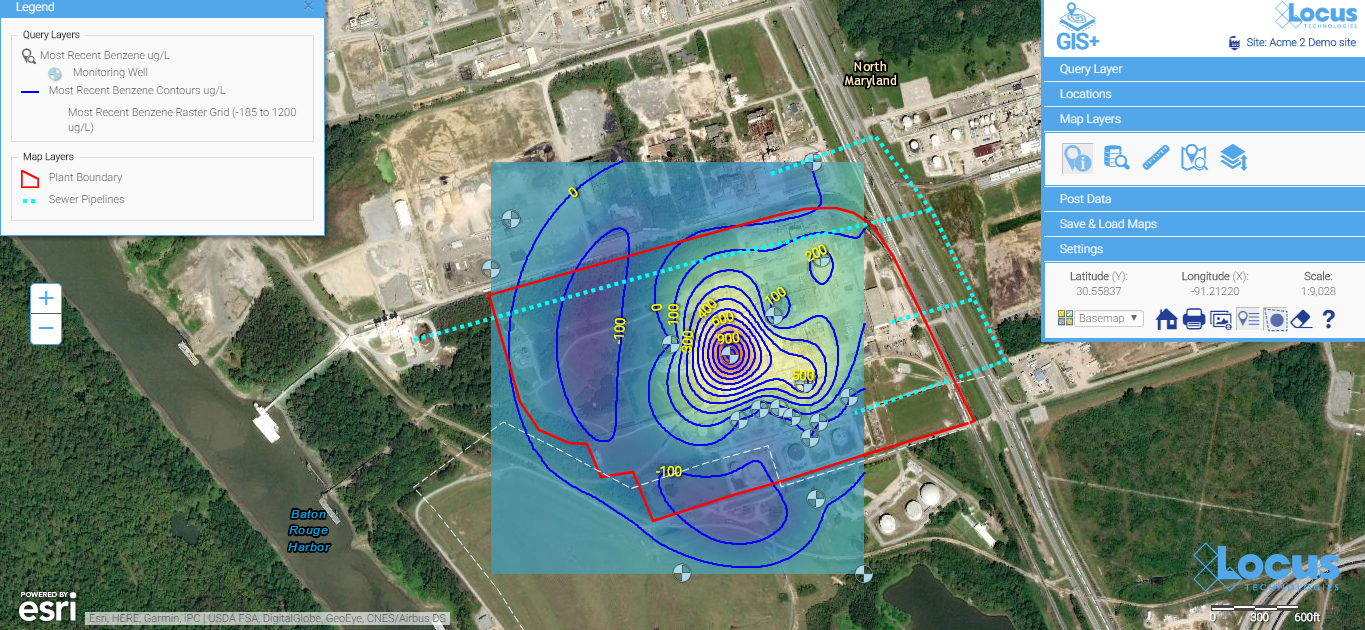
Contour maps make it easy to visualize the source and extent of the plumes. They can be easily created with environmental database management systems that include basic contouring functionality.
4) Look for something easy to use that doesn’t require staff with specialized mapping knowledge
Many companies use sophisticated and expensive mapping software for their needs. But the people running those systems are highly trained and often don’t have easy access to your environmental data. For routine data review and analysis, simple is better. Save the expensive, stand-alone GIS for wall-sized maps and complex regulatory reports.
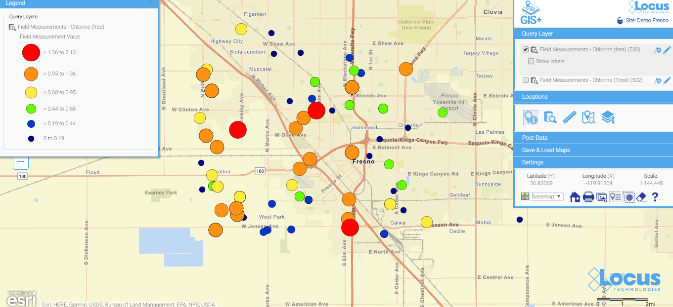
Here is a simple map (which is saved, so anyone can run it) showing today’s chlorine data in a water distribution system. You don’t have to wait for the GIS department to create a map when you use a GIS that’s integrated with your environmental database system. When data are updated daily from field readings, these maps can be incredibly helpful for operational personnel.
 See your data in new ways with Locus GIS for environmental management.
Locus offers integrated GIS/environmental data management solutions for organizations in many industries.
Find out more >
Taking the next steps
After viewing some of the many visualization possibilities in this blog, the next step is make some maps happen!
- Make sure your environmental data system has integrated mapping options.
- Make sure your sampling/evaluation/monitoring locations have a consistent set of coordinates. If you have a mixed bag of coordinate systems, you will need to standardize. Otherwise, your maps will not be meaningful. Here are some options to try, as well as some good resource sites:
- https://epsg.io/ (transformations)
- http://www.earthpoint.us/Convert.aspx (transformations)
- Start with a few easy maps—and build from there.
Happy mapping!