Getting More from your Environmental Data using Dashboards with Integrated Mapping
Ready to use GIS software? Jump to the Locus GIS product page>
Today is GIS Day, a day started in 1999 to showcase the many uses of geographical information systems (GIS). Earlier Locus blog posts have explained how GIS and maps support visualization of objects in space and over time. This post covers a specific visualization method called data dashboards.
A data dashboard is a combination of charts, maps, text, and images that enables analysis of data and thereby promotes discovery of previously unknown relationships in the data. Companies and organizations use dashboards to develop insight into the overall status of a company or of a company division, process, or product line. Dashboards are also a common function in ‘business intelligence’ applications such as Microsoft Power BI and Tableau. A printed dashboard is static, but an online dashboard can be dynamic; in a dynamic dashboard, interacting with one item on the dashboard causes the other items to update. Taken together, the visualizations on a dynamic dashboard can help you find the story in your data.
One reason dashboards are so helpful is that they allow humans to partially ‘offload’ their thinking. Cognitive research has shown that human ‘working memory’ handles at most four items at a time. A good visualization, however, reduces the number of items to process in memory.
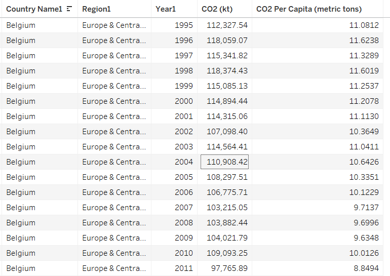
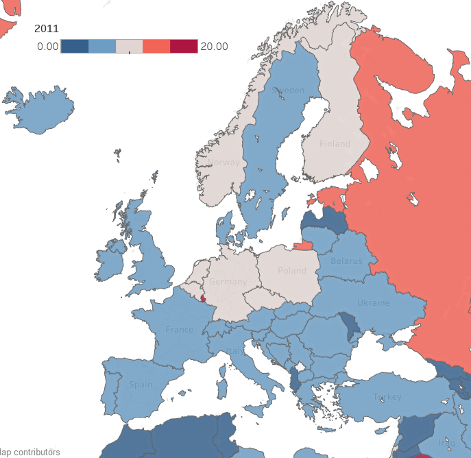
Consider a large table of carbon dioxide emissions by country for multiple years; it can be difficult to keep all the numbers in mind if you are trying to find trends.
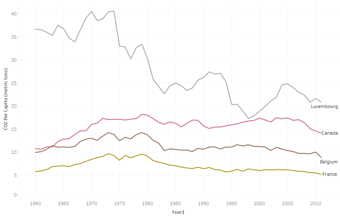
If you plot the data in a graph, however, each series of data in the chart becomes just one line on the graph. It is much easier to compare lines on the chart than to compare columns of numbers.
Now consider making a map with countries color coded by emissions. Again, for each country, the map reduces multiple numbers to a single color for that country on the map. You can compare country colors more easily than columns of numbers.
A dashboard that combines multiple visualizations further enhances data analysis. Imagine a dynamic dashboard showing you both the emissions chart and map described above. If you select a country on the map, the chart can highlight the line for that country, so you compare its emissions to other countries over time. Similarly, if you select a line on the chart for a specific country, the map can highlight the selected country to show how its emissions compare to nearby countries. This interactivity lets you drill into your data more effectively than using either the chart or the map by itself.
Here are three examples of effective dashboards that are available online:
- The Covid-19 dashboard from John Hopkins shows a map, charts, and tables of Covid -19 cases.
- The Global Climate Dashboard from NOAA shows charts of multiple climate indicators.
- The Carbon Pricing dashboard from the World Bank lets you drilldown to see carbon pricing initiatives for various nations.
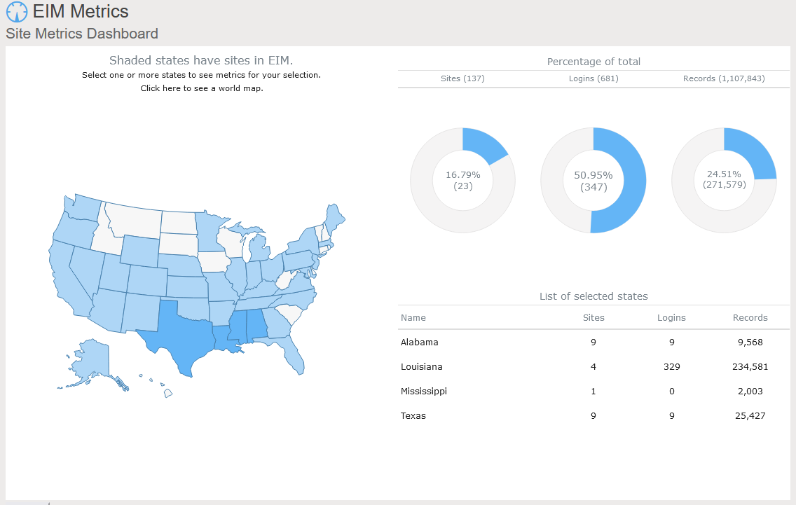
Locus includes data dashboards in our applications. One example is the Site Metrics dashboard in EIM, Locus’s cloud-based, software-as-a-service application for environmental data management. The Site Metrics dashboard lets you perform roll-up queries across your portfolio of sites. A map on the dashboard shows all states with active sites. If you select one or more states, the dashboard updates the charts and tables on the right to show total sites, user logins, and record counts. Other dashboards can support showing sample locations of certain chemicals or counts of regulatory limit exceedances.
A further example comes from the Locus Environmental Social and Governance (ESG) application. ESG metrics are becoming increasingly important measures for an organization’s performance. Data dashboards can help companies quickly visualize trends in their ESG metrics using intuitive mapping tools.
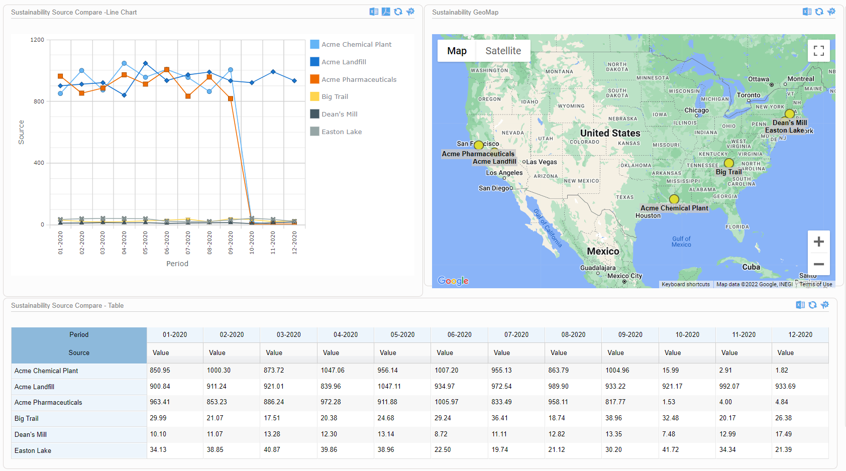
This dashboard illustrates both spatial and time trends and provides the raw data necessary for auditability and transparent decision making. Having these features on a single combined view provides users with instant access to the key inputs for ESG prioritization, planning, and project implementation.
As these examples from Locus show, data dashboards with integrated mapping are important tools for maximizing the value of your collected environmental and ESG data. For any dataset with a geographic component, it’s important to incorporate mapping elements in the outputs, to highlight trends and patterns that may not otherwise be visible in a chart or table. Modern software can combine these output formats in a way that tells the story shown by your data.
Interested in Locus’ GIS solutions?
Locus GIS+ features all of the functionality you love in EIM’s classic Google Maps GIS for environmental management—integrated with the powerful cartography, interoperability, & smart-mapping features of Esri’s ArcGIS platform!
Learn more about Locus’ GIS solutions.
About the Author—Dr. Todd Pierce, Locus Technologies
Dr. Pierce manages a team of programmers tasked with development and implementation of Locus’ EIM application, which lets users manage their environmental data in the cloud using Software-as-a-Service technology. Dr. Pierce is also directly responsible for research and development of Locus’ GIS (geographic information systems) and visualization tools for mapping analytical and subsurface data. Dr. Pierce earned his GIS Professional (GISP) certification in 2010.