In a Software as a Service (SaaS) delivery model, service uptime is vital for several reasons. Besides the obvious of having access to the service over the internet at any given time and staying connected to it 24/7/365, there are additional reasons why service uptime is essential. One of them is quickly verifying the vendor’s software architecture and how it fits the web.
Locus is committed to achieving and maintaining the trust of our customers. Integral to this mission is providing a robust compliance program that carefully considers data protection matters across our cloud services and service uptime. After security, service uptime and multitenancy at Locus come as a standard and, for the last 25 years, have been the three most essential pillars for delivering our cloud software. Our real-time status monitoring (ran by an independent provider of web monitoring services) provides transparency around service availability and performance for Locus’ ESG and EHS compliance SaaS products. Earlier I discussed the importance of multitenancy in detail. In this article, I will cover the importance of service uptime as one measure to determine if the software vendor is running genuine multitenant software or not.
Service Uptime
If your software vendor cannot share uptime statistics across all customers in real-time, they most likely do not run on a multitenant SaaS platform. One of the benefits of SaaS multitenancy (that is frequently overlooked during the customer software selection process) is that all customers are on the same instance and version of the software at all times. For that reason, there is no versioning of software applications. Did you ever see a version number for Google’s or Amazon’s software? Yet they serve millions of users simultaneously and constantly get upgraded. This is because multitenant software typically provides a rolling upgrade program: incremental and continuous improvements. It is an entirely new architectural approach to software delivery and maintenance model that frees customers from the tyranny of frequent and costly upgrades and upsell from greedy vendors. Companies have to develop applications from the ground up for multitenancy, and the good thing is that they cannot fake it. Let’s take a deeper dive into multitenancy.
An actual multitenant software provider can publish its software uptime across all customers in real-time. Locus, for example, has been publishing its service uptime in real-time across all customers since 2009. Locus’s track record speaks for itself: Locus Platform and EIM have a proven 99.9+ percent uptime record for years. To ensure maximum uptime and continuous availability, Locus provides redundant data protection and the most advanced facilities protection available, along with a complete data recovery plan. This is not possible with single-tenant applications as each customer has its software instance and probably a different version. One or a few customers may be down, others up, but one cannot generally aggregate software uptime in any meaningful way. The fastest way to find if the software vendor offers multitenant SaaS or is faking it is to check if they publish online, in real-time, their applications uptime, usually delivered via an independent third party.
Legacy client-server or single-tenant software cannot qualify for multitenancy, nor can it publish vendor’s uptime across all customers. Let’s take a look at definitions:
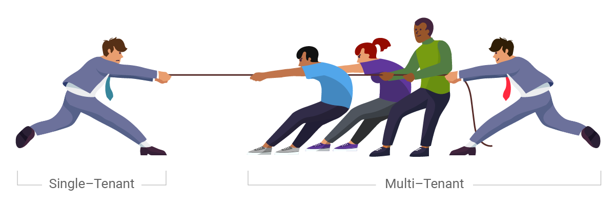
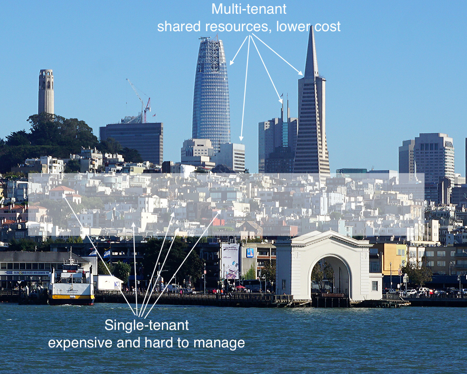
Single-Tenant – A single instance of the software and supporting infrastructure serves a single customer. With single-tenancy, each customer has their independent database and instance of the software. Essentially, there is no sharing happening with this option.
Multitenant – Multitenancy means that a single instance of the software and its supporting infrastructure serves multiple customers. Each customer shares the software application and also shares a single database. Each tenant’s data is isolated and remains invisible to other tenants.
A multitenant SaaS provider’s resources are focused on maintaining a single, current (and only) version of the software platform rather than being spread out in an attempt to support multiple software versions for customers. If a provider isn’t using multitenancy, it may be hosting thousands of single-tenant customer implementations. Trying to maintain that is too costly for the vendor, and sooner or later, those costs become the customers’ costs.
A vendor invested in on-premise, hosted, and hybrid models cannot commit to providing all the benefits of an actual SaaS model due to conflicting revenue models. Their resources will be spread thin, supporting multiple software versions rather than driving SaaS innovation. Additionally, suppose the vendor makes most of their revenue selling on-premise software. In that case, it is difficult for them to fully commit to a proper SaaS solution since most of their resources support the on-premise software. In summary, a vendor is either multitenant or not – there is nothing in between. If they have a single application installed on-premise of customer or single-tenant cloud, they do not qualify to be called multitenant SaaS.
Before you engage future vendors for your enterprise ESG reporting or EHS compliance software, assuming you already decided to go with a SaaS solution, ask this simple question:
Can you share your software uptime across ALL your customers in real-time? If the answer is no, pass.
Multitenancy Explained
And if the vendor suddenly introduces a “multitenant” model (after selling an on-premises or single-tenant software version for 10+ years), who in the world would want to migrate to that experimental cloud without putting the contract out to bid to explore a switch to well established and market-tested actual multitenant providers? The first-mover advantage of multitenancy is a considerable advantage for any vendor. Still not convinced? Let me offer a simple analogy to drive home the point as to why service uptime and multitenancy matter: Tesla vs. Edison–War of Currents.
The War of Currents was a series of events surrounding the introduction of competing electric power transmission systems in the late 1880s and early 1890s that pitted companies against one another and involved a debate over the cost and convenience of electricity generation and distribution systems, electrical safety, and a media/propaganda campaign, with the leading players being the direct current (DC) based on the Thomas Edison Electric Light Company and the supporters of alternating current (AC) based on Nikola Tesla’s inventions backed by Westinghouse.
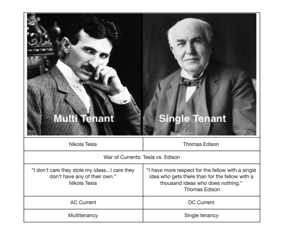
With electricity supplies in their infancy, much depended on choosing the right technology to power homes and businesses across the country. The Edison-led group argued for DC current that required a power generating station every few city blocks (single-tenant model). In contrast, the AC group advocated for a centralized generation with transmission lines that could move electricity great distances with minimal loss (multitenant model).
The lower cost of AC power distribution and fewer generating stations eventually prevailed. Multitenancy is equivalent to AC regarding cost, convenience, and network effect. You can read more about how this analogy relates to SaaS in the book by Nicholas Carr, “Big Switch.” It’s the best read so far about the significance of the shift to multitenant cloud computing. Unfortunately, the ESG/EHS software industry has lagged in adopting multitenancy.
Given these fundamental differences between different modes of delivering software as a service, it is clear that the future lies with the multitenant model.
Whether all customer data is in one or multiple databases is of no consequence to the customer. For those arguing against it, it is like an assertion that companies “do not want to put all their money into the same bank account as their competitors,” when what those companies are doing is putting their money into different accounts at the same bank.
When customers of a financial institution share what does not need to be partitioned—for example, the transactional logic and the database maintenance tools, security, and physical infrastructure and insurance offered by a major financial institution—then they enjoy advantages of security, capacity, consistency, and reliability that would not be affordably deliverable in isolated parallel systems.
Locus has implemented procedures designed to ensure that customer data is processed only as instructed by the customer throughout the entire chain of processing activities by Locus and its subprocessors. Amazon Web Services, Inc. (“AWS”) provides the infrastructure used by Locus to host or process customer data. Locus hosts its SaaS on AWS using a multitenant architecture designed to segregate and restrict customer data access based on business needs. The architecture provides an effective logical data separation for different customers via customer-specific “Organization IDs” and allows customer and user role-based access privileges. The customer interaction with Locus services is operated in an architecture providing logical data separation for different customers via customer-specific accounts. Additional data segregation ensures separate environments for various functions, especially testing and production.
Multitenancy yields a compelling combination of efficiency and capability in enterprise cloud applications and cloud application platforms without sacrificing flexibility or governance.