Making water quality data more transparent: Lessons from an annual water quality report
A few weeks ago, I received my water bill in the mail, right on schedule. But this time, it came with a glossy pamphlet containing the annual water quality report. Normally I just toss it into the trash unread. It’s full of small print and lots of numbers, and I was never that concerned about our water quality.
I live in the NC mountains, where the water comes from “pristine mountain springs and streams”. And having grown up in New Orleans— spending 21 years drinking water from the polluted tail end of the Mississippi River— I figured any damage was already done. (But that New Orleans water sure was tasty!)
This time, though, I actually read the entire report. I’d heard about recent water issues in Flint, MI, and other cities, and I do have children who drink the water here. So I looked at this City of Asheville water quality report in detail, and here’s what I discovered.
The report contains a lot of rather informative text about how the City of Asheville treats its water and what possible risks could be present from various contaminants. The centerpiece of the report is a table that lists detected substances in the water. In 2015, 13 substances were detected out of 150 substances sampled for, and those 13 were “well within safe levels”. That sounded good. But then I started looking at the report and wondering about certain things…
Let’s start with lead. The report has this:
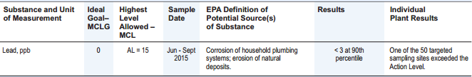
City of Asheville’s 2015 Water Quality Report: Lead, ppb
The “Highest Level Allowed” (the maximum contaminant level, or MCL) is 15 parts per billion (ppb). I did some searching and found a good article explaining lead sampling in water. If over 10% of tests come back over that level of 15 ppb, then the water utility must warn residents.
Asheville seems to have passed this test (only one sample exceeded the action level). However, the article mentioned above also describes how the tests for Flint, MI had possible problems because the Michigan Department of Environmental Quality threw out two samples. With those samples included, the number of samples over the limit would have exceeded 10%, and water customers would have received a much earlier warning of possible lead issues.
So, back to Asheville. Were any samples thrown out— and if so, why? That information is not in the report.
Let’s take one more example: hexavalent chromium. Here is the City of Asheville report:
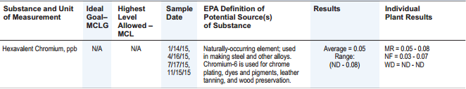
City of Asheville’s 2015 Water Quality Report: Hexavalent Chromium, ppb
So, the average hexavalent chromium level in the water is 0.05 ppb. But there is no action level given, and the EPA definition text says nothing about any possible side effects. Through more searching, I learned that although hexavalent chromium is a carcinogen, the US EPA does not have a maximum contaminant level (MCL) for this compound.
California has a public health goal of 0.02 ppb, but North Carolina has a public health goal of 0.07 ppb. So, how would I interpret the Asheville value of 0.05 that falls in the middle of those two numbers? At least the report provides the detected range (ND – 0.08), so the maximum level in any sample was only a bit higher than the 0.07 level.
These two examples are not meant to disparage Asheville’s Annual Water Quality Report— it is a great way to deliver some basic information to water users. But for motivated water users, the report will lead to other questions— to answer these questions would require more context or a deeper dive into the actual data. Also, while I’m personally fairly tech-savvy and scientifically literate, many water users may lack the numerical and verbal literacy skills needed to understand the report.
For some closing thoughts:
- How can water utilities make their sample data more transparent and available to users who want to take the “deeper dive”? How can users learn about sampling processes and decisions made— for example, “were any lead samples rejected, and why?”
- How do users evaluate risks from compounds without EPA maximum contaminant levels, especially when states and regulators have conflicting levels?
- How do water utilities present trend information and changes in water quality procedures over time? The 2015 report only shows data from that year. I dug up some older reports and found that hexavalent chromium was not detected at all in 2014. So what caused the detects in 2015? Also, lead was sampled at 100 sites in 2014, but only 50 sites in 2015. Why was the number of samples cut in half?
- How do you balance presenting too much information to the public (causing information overload) with presenting too little (causing users to be uninformed about quality issues)? Is there a way to show key information, but let users drill down into actual sampling data results for further details?
- As a follow up to that last question— if you allow public access to sampling data, how do you ensure customers can interpret that data correctly, if those customers lack knowledge of sampling processes and any statistical techniques used?
- Can the power of the internet be harnessed to distribute this data and make it understandable to customers? Are there tools that customers can use to explore the data on their own and see key findings and trends? I could not find anything online for Asheville.
- Finally, given that a certain level of technical understanding is needed to read the Annual Report and explore any actual data— do we need a neutral party to serve as interpreter and interlocutor for the public when dealing with water utilities? Who would play that role?
Other Locus contributors will explore some of these issues in future posts. In the meantime, please share your own thoughts and ideas in the comments section below.

About guest blogger— Dr. Todd Pierce, Locus Technologies
Dr. Pierce manages a team of programmers tasked with development and implementation of Locus’ EIM application, which lets users manage their environmental data in the cloud using Software-as-a-Service technology. Dr. Pierce is also directly responsible for research and development of Locus’ GIS (geographic information systems) and visualization tools for mapping analytical and subsurface data.