Advanced Visualization for Environmental Data
Go Beyond Line Charts
Locus supports common visualization types in our EIM and Platform applications to help you analyze your data: pie charts, bar and line graphs, and scatter plots. However, Locus provides other advanced visualization types to bring more energy to your data analysis. Here are some of the more powerful visualization types in EIM and Locus Platform.
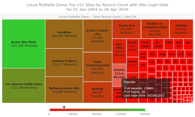
Heatmaps
A heatmap is simply a graphic that uses different colors to represent different values. A map of temperature, for example, may use colors from blue to red to represent values going from cold to hot. You can easily create heatmaps in Locus applications. Here is a heatmap of record count and user logins grouped by facility.
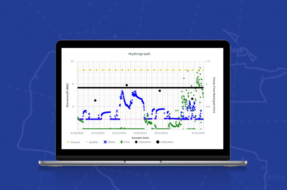
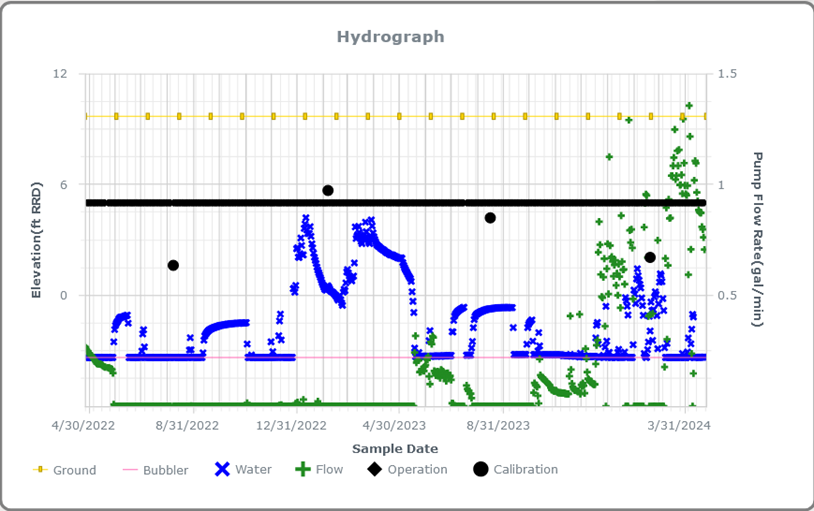
Hydrograph
A hydrograph plots groundwater elevations along with flow rates. The graph can also include other elevation values for reference or calibration. Locus applications can generate hydrographs as in the example below.
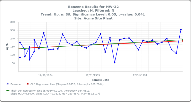
Regression line
A regression line on a chart is the ‘best fit line’ that minimizes the distance of the actual data points from the predicted points. The line can be used to forecast the future value of data points. Locus applications generate two type of regression lines, ordinary least squares (OLS) and Thiel-Sen. The example below graphs the predicted trends in Benzene concentration over time for one location.
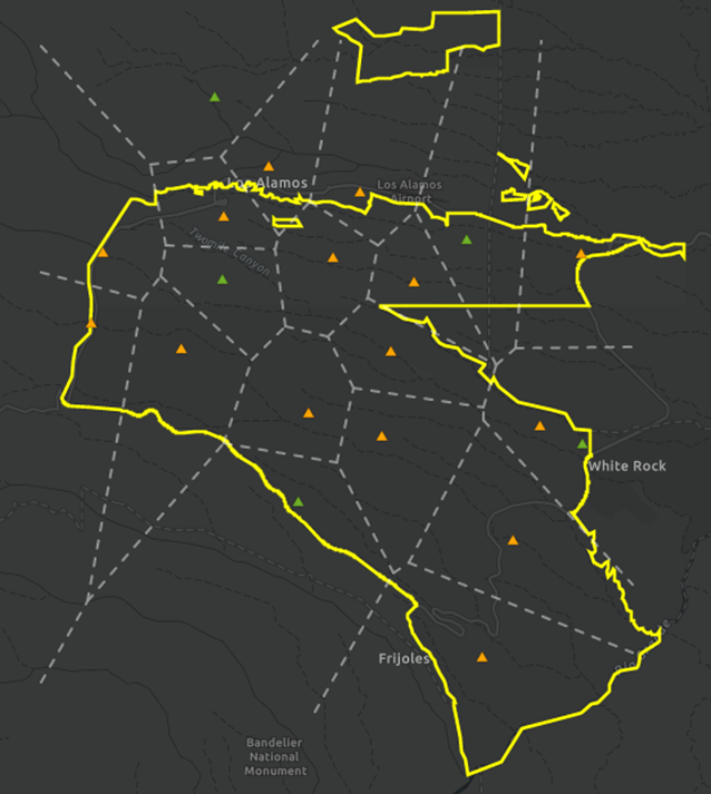
Voronoi diagram
A Voronoi diagram takes a set of locations and creates regions surrounding each location so that every point in a region is closest to the location within that region. Voronoi diagrams have many applications, such as finding the closest cell phone tower, subway station, or hospital to your address. Locus uses Voronoi diagrams to perform similar ‘closest location’ analysis. Here is a map of rain gauges with a Voronoi diagram showing the expected coverage areas for the gauges.
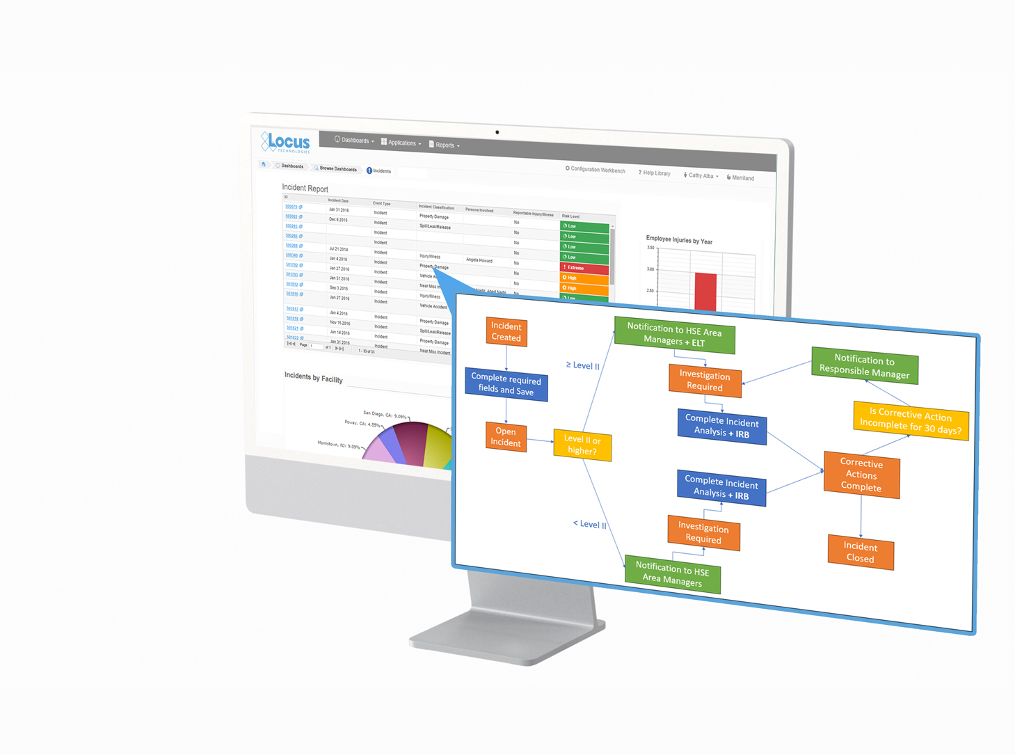
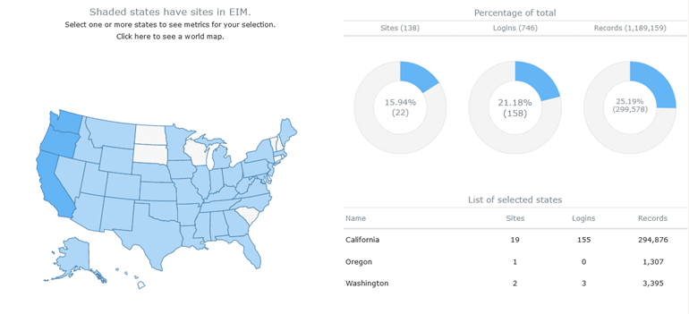
Dashboard
A dashboard is a user interface that groups multiple data visualizations to show relations among different data sets. Both EIM and Locus Platform let you create dashboards. Here is an example using a map, table, and three pie charts to provide record and login counts across a portfolio of facilities.
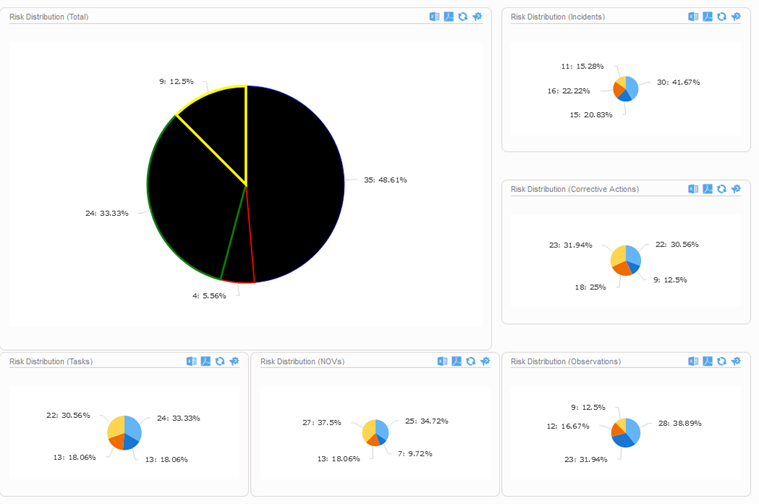
Here is a final example using several pie charts to present risk distribution across multiple categories.
Locus provides powerful visualization types beyond basic graphs. Contact Locus Technologies for more information!